Value and name pickers
A value picker lets the user choose one or multiple values from a list. A name picker lets the user choose one or multiple names from a list. The value or values are applied to an associated control. Both pickers work similarly.
Using the pickers
A picker renders an icon that triggers a dialog when clicked: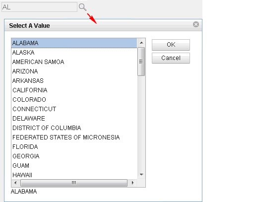
The picker
is associated with another control through the for property.
The picker uses the value, if any, of the associated control for its
initial selection. When the user closes the picker dialog with the OK button,
the picker applies selected values to the associated control.
The picker knows if the associated control accepts single or multiple values and adapts its behavior accordingly. The picker also recognizes the character used to separate the multiple values if appropriate.
The pickers can display data from various sources and have different renderings.
Selecting the data to display
The pickers use a complex typedataProvider to access the selection
data. This separates the UI from the data and allows different data
sources. Each data provider has its own set of properties which can
be set on the All Properties tab: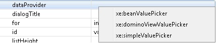
This list shows the default providers and is extensible on a global or application basis.
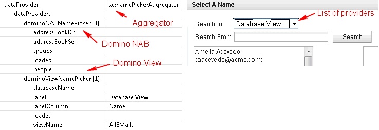
The values returned by the data providers can have optional labels. The picker displays the label and stores the value.
Setting the picker UI
Both the value and the name picker come with a default rendering. It is a basic list for the value picker and a more complex dialog for the name picker: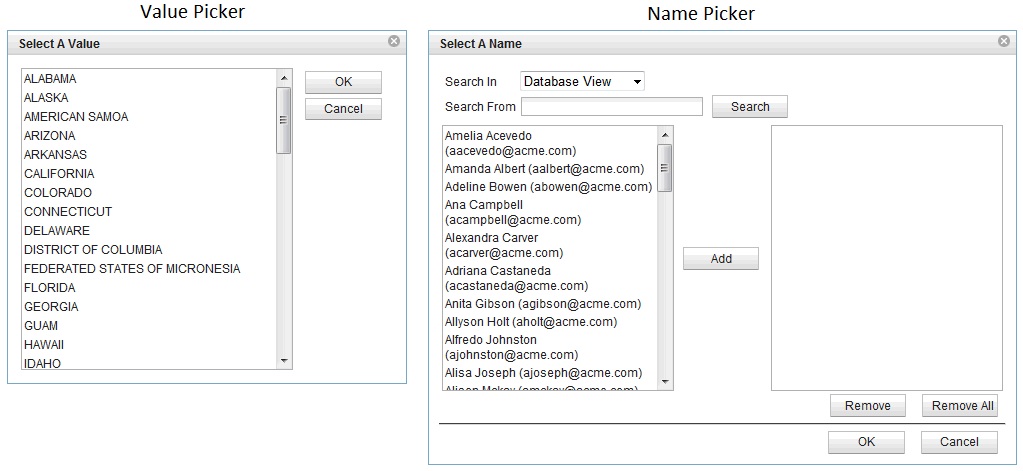
dojoType and dojoAttributes properties.
For example, a checkbox dialog can be applied by setting the following
values :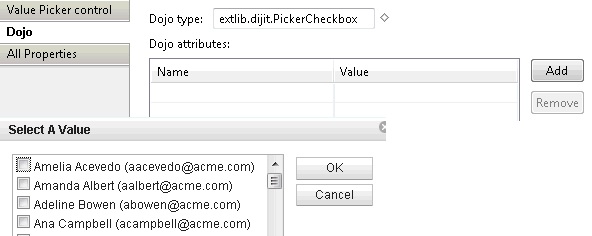
Enabling typeahead
ThetypeAhead control
can be used with the pickers. The picker adapts the data coming from
the data provider to what the typeahead control expects whenever the
data set is a basic list or custom markup.typeAhead control to the control associated
with the picker and set the following properties:<xp:typeAhead mode="partial" minChars="1" preventFiltering="true">The preventFiltering property
ensures that typeahead lets the data provider filter the data. This
is not required but makes the control perform better. The mode="partial" property
ensures that only the typeahead control is triggered when a typeahead
request occurs.
suggestions formula to
get its input from the picker: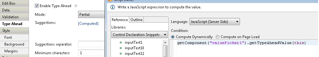
Providing custom data providers
Custom data providers can be provided. Here are the possibilities:- Using JavaScript for the value picker
simpleDataProvider.The data provider implementation allows a developer to execute server-side JavaScript. To keep the JavaScript simple, this provider can only return string values without associated labels.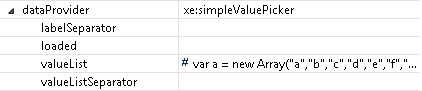 Here is the kind of JavaScript that can be coded:
var a = new Array("a","b","c","d","e","f","g","h")
return a
You can return a single string ifvalueListSeparatoris specified:return "a,b,c,d,e,f,g,h" - Using a managed bean for a value/name picker
beanXXXPicker.This method gives the full capability of a data provider without having to register a new complex type to the XPages run time. This method can be chosen when the provider is specific to an application.- Create a JavaScript class that implements either
IValuePickerDataorINamePickerData, depending of the kind of data. Look, at theSimplePickerclass in the demo application. - Add a
beanXXXPickerdata provider and make it point to your bean. If a class name is specified, an instance is created when needed. To get better control of the life cycle of the bean, use a managed bean and use its published name in thedataBeanproperty.
- Create a JavaScript class that implements either
Providing a custom UI
A developer can provide a custom UI for a picker. It has to be done via a custom Dojo module that defines a new dijit. This dijit should extendextlib.dijit.TemplateDialog.
Although it is not required, extending this base class provides help
for displaying the popup dialog, managing the browser differences,
and handling some common events such as OK and Cancel.dlgTitle: the title of dialog
control: the client id of the associated input text
url: the REST service URL
sources: an optional array of source (directory list)This
can be extended by using custom picker renderers. For more information,
look at the PickerCheckbox.js file, which defines
the simplest dijit. It shows how the REST service should be called,
how it communicates with the input text and how it creates check boxes
based on the data list.