Using glyphicons as part of responsive design
Instead of graphics and image files, the responsive design feature uses glyphs from the glyphicon font file for icons wherever possible in the XPages and Extension Library controls
Glyphicons Halflings is a set of 200 glyphs, contained in a single font file, that come as part of Bootstrap. Instead of graphics and image files, the responsive design feature uses glyphs from the glyphicon font file for icons wherever possible in the XPages and Extension Library controls. The benefit of doing this is that there are fewer files to download when loading your application. The font icons are scalable so that they do not look like a collection of pixels when enlarged. The color or the size of the icon can also be easily changed using simple CSS styling.
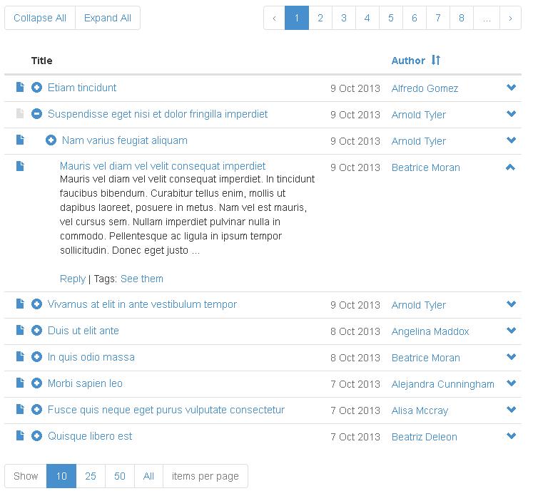
This examples shows glyphs being used with the Data View control
<xp:panel id="panel1"  style="width:320px;margin: 10px;">
  <xp:div id="div1" styleClass="glyphicon glyphicon-shopping-cart"></xp:div>
  <xp:br />
  <xp:div id="div2">
    <xp:div styleClass="glyphicon glyphicon-hand-right"
            style="color:red;font-size:30px;display:inline;"></xp:div>
      <xp:label value="My Label" id="label1"></xp:label>
    </xp:div>
    <xp:br />
    <xp:div id="div3" styleClass="input-group">
    <xp:inputText id="inputText1" styleClass="form-control"></xp:inputText>
    <xp:div styleClass="glyphicon glyphicon-plus-sign input-group-addon"         	   	      style="color:green;"></xp:div>
  </xp:div>
  <xp:br />
  <xp:div id="div4" style="padding-bottom:10px;">
    <ul id="tabs" class="nav nav-tabs" role="tablist">
      <li class="active">
        <xp:link styleClass="glyphicon glyphicon-home"
                 style="font-size:28px" value="#"></xp:link></li>
      <li><xp:link styleClass="glyphicon glyphicon-cloud"
                   style="font-size:28px" value="#"></xp:link></li>
      <li><xp:link styleClass="glyphicon glyphicon-phone"
                   style="font-size:28px" value="#"></xp:link></li>
      <li><xp:link styleClass="glyphicon glyphicon-thumbs-up"
                   style="font-size:28px" value="#"></xp:link></li>
      <li><xp:link styleClass="glyphicon glyphicon-globe"
                   style="font-size:28px" value="#"></xp:link></li>
    </ul>
  </xp:div>
  <xp:div>
    <xp:button id="button1" styleClass="glyphicon glyphicon-star btn-primary"  			  style="font-size:16pt;color:white"></xp:button>
    <xp:button id="button2" styleClass="glyphicon glyphicon-ok btn-success"
		  style="font-size:16pt;color:white"></xp:button>
    <xp:button id="button3" styleClass="glyphicon glyphicon-info-sign btn-info" 			  style="font-size:16pt;color:white"></xp:button>
    <xp:button id="button4" styleClass="glyphicon glyphicon-exclamation-sign btn-warning" 		  style="font-size:16pt;color:white"></xp:button>
    <xp:button id="button5" styleClass="glyphicon glyphicon-remove btn-danger" 	  	         style="font-size:16pt;color:white"></xp:button>
  </xp:div>
</xp:panel>
The code produces this result:
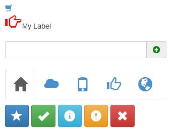
As
the code indicates, adding the glyphicons to your application is done
by adding the glyphicon class and a class for a specific
icon. Changing the size and color is also easily done by specifying color and font-size style
attributes. Refer to the Bootstrap web site for more complete information
on glyphicons.