
Creating a custom widget
A widget is a frame that displays a specific type of store content, such as ads, product recommendations, or navigational links. This document explains the steps to be followed to create a custom widget.
About this task
| Property | Description |
|---|---|
| Title | This text input is the title that is given to the widget. |
| Height | The radio buttons are given with two options, Tall and Short. |
Procedure
-
Add a widget definition in the tooling.
- Adding a widget definition in the tooling depends on the widget
definitions given in the PLWIDGETDEF table.
Before making any change in the tooling user interface, widget
definitions must be inserted into the table. In this example, a widget
definition for store ID (STOREENT) 0 is added:
INSERT INTO PLWIDGETDEF(PLWIDGETDEF_ID, STOREENT_ID, IDENTIFIER, VENDOR, WIDGETTYPE, JSPPATH, DEFINITIONXML, STATE, CREATEDATE, LASTUPDATE)
VALUES(-100000, 0, 'example_widget', 'hcl', 1, '', '<Definition> </Definition>', 1, CURRENT DATE, CURRENT DATE);
Note: The value for PLWIDGETDEF_ID must be unique. Do not pick a value that is close to the default values. This will prevent conflicts with the future widget definitions provided by HCL Commerce.Query: SELECT * FROM plwidgetdef ORDER BY PLWIDGETDEF_IDTable 2. PLWIDGETDEF table PLWIDGETDEF_ID STOREENT_ID IDENTIFIER UI_OBJECT_NAME VENDOR WIDGETTYPE DEFENITIONXML 1504 11501 'SubCategoryPageContainer' NULL 'ibm' 2 'Container/SubCategoryPageContainer.jsp' 1505 11501 'SearchLandingPageContainer' NULL 'ibm' 2 'Container/LandingPageContainer.jsp' 1506 11501 'StaticContentContainer' NULL 'ibm' 2 'Container/StaticContentContainer.jsp' 1507 11501 'SearchResultPageContainer' NULL 'ibm' 2 'Container/SubCategoryPageContainerWithTabs.jsp' 1508 11501 'ProductPageContainer' NULL 'ibm' 2 'Container/ProductPageContainer.jsp' 1509 11501 'ProductPageContainer(2)' NULL 'ibm' 2 'Container/ProductPageContainerFullWidth.jsp' -100000 11501 'example_widget' NULL hcl' 1 ''
- Adding a widget definition in the tooling depends on the widget
definitions given in the PLWIDGETDEF table.
Before making any change in the tooling user interface, widget
definitions must be inserted into the table. In this example, a widget
definition for store ID (STOREENT) 0 is added:
-
Add the created PLWIDGETDEF_ID to the
PLSTOREWIDGET table for all the stores you want to
enable this widget for. In this example, enabling the widget for EmeraldCAS
store. The store ID is 12501).
INSERT INTO WCS.PLSTOREWIDGET (PLSTOREWIDGET_ID, STOREENT_ID, PLWIDGETDEF_ID, STATE, DEFINITIONXML, OPTCOUNTER) VALUES(-100000, 12501, -100000, 1, NULL, 0); -
After updating the database with a new widget definition (ID - 100000 ), update
the tooling user interface. Two components handle the business logic of widget
definitions and their management:
- Layout widget details
- Layout widget, which is under the page-builder components directory. This directory can be found at commerce-tooling/src/app/features/page-builder/components.
-
Update the layout-widgets.json file in the Layout-widget
component.
The Layout-widget component is responsible for listing widgets in the Layout tab of the Page Composer tool. The Layout-widget component consists of the following files:
- layout-widgets.component.ts
- layout-widgets.component.html
- layout-widgets.component.scss
- layout-widgets.json
-
Add the following lines of code in the layout-widgets.json
file.
{ "id": "-100000", "name": "example-widget", "title": "PAGE_BUILDER.EXAMPLE_WIDGET", "description": "PAGE_BUILDER.EXAMPLE_WIDGET_DESCRIPTION", "properties": [ { "name": "title", "value": "Title!" }, { "name": "height", "value": "short" } - Save and close the file.
-
After updating the code, add new translation strings in the translation files.
To display the Name and
Description fields accurately, update the
en-US.json file available at the
commerce-tooling/assets/i18 location:
"EXAMPLE_WIDGET": "Example Widget", "EXAMPLE_WIDGET_DESCRIPTION": "Example widget description!", "TITLE": "Title", "HEIGHT": "Height", "SHORT": "Short", "TALL": "Tall", "INVALID_TITLE": "Invalid title", -
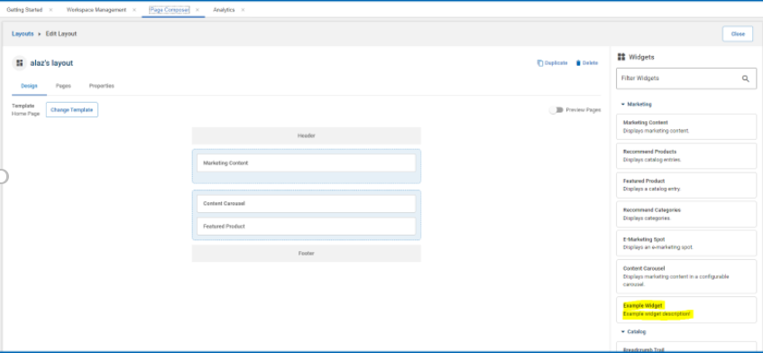
Save and close the file. The Example-widget is displayed
in the Widgets tab of the Layout
section as shown below:
- After updating the name and description of the widget, modify the layout-widget-details. Follow Widget properties and content to modify and update the widget properties.
-
The layout-widget-details is composed of four
files:
- layout-widget-details.json: This file has the
widget details defined and listed.
- Update the layout-widget-details.json file
with the following lines of code:
{
"id": "-100000",
"title": "PAGE_BUILDER.EXAMPLE_WIDGET",
"exampleWidgetType: true
}
Note: As it is a custom widget, theexample-widget-typeflag is added because the parameters it contains are different from the other widgets.
- Update the layout-widget-details.json file
with the following lines of code:
- layout-widget-details.component.html: This is the
template of the layout-widget-details component.
Based on the widget type, this file should be updated for the text input
and a radiobox input with a flag that toggles custom fields on or off.
- Update the
layout-widget-details.component.html
file with the following lines of
code:
<ng-container *ngIf="widgetType.exampleWidgetType">
<mat-form-field appearance="outline">
<mat-label>{{'PAGE_BUILDER.TITLE' | translate}}</mat-label>
<input matInput id="titleInput" formControlName="titleInput" [maxlength]="256" autocomplete="off">
<mat-error *ngIf="titleInput.errors">
{{'PAGE_BUILDER.INVALID_TITLE' | translate }}
</mat-error>
</mat-form-field>
<div class="hc-type-label">{{ 'PAGE_BUILDER.HEIGHT' | translate }}</div>
<mat-radio-group formControlName="height">
<mat-radio-button value="short">{{'PAGE_BUILDER.SHORT'| translate}}</mat-radio-button>
<mat-radio-button value="tall">{{'PAGE_BUILDER.TALL'| translate}}</mat-radio-button>
</mat-radio-group>
</ng-container>
- Update the
layout-widget-details.component.html
file with the following lines of
code:
- layout-widget-details.component.ts: This file acts
as a controller of the component. Following are the few functions that
can be managed by updating this file:
- Loading the widget details from the layout-widget-details.json file.
- Setting the necessary flags.
- Controlling the changes made to the widget.
- Persisting the changes made to widget.
- Add two form controls, titleInput and
height. Update the file with the
following lines of
code:
widgetTypes: Array<any> = (LayoutWidgetTypes as any).default; widgetType: any = null; widgetForm: FormGroup; name: FormControl; wrap: FormControl; autoSlideshow: FormControl; interval: FormControl; playDirection: FormControl; populationChoice: FormControl; emsType: FormControl; emsName: FormControl; titleInput: FormControl; height: FormControl; @ViewChild("nameInput") nameInput: ElementRef<HTMLInputElement>; - Define and initialize the titleInput and height controls. Change the createFormControls() and createForm() methods to define and initialize the controls.
- Update the file with the following lines of
code:
this.height.setValue(widgetProperties.height);
if (this.widgetType?.exampleWidgetType) {
this.titleInput.enable();
this.height.enable();
} else {
this.titleInput.disable();
this.height.disable();
}
private createForm() { this.widgetForm = new FormGroup({ name: this.name, wrap: this.wrap, autoSlideshow: this.autoSlideshow, interval: this.interval, playDirection: this.playDirection, populationChoice: this.populationChoice, emsType: this.emsType, emsName: this.emsName, titleInput: this.titleInput, height: this.height }); } } - Implement the initial loading logic for custom fields in the
initialize() method. Update the file with
the following lines of
code:
this.emsName.setValue(widgetProperties.emsName); this.titleInput.setValue(widgetProperties.title); this.height.setValue(widgetProperties.height); if (this.widgetType?.exampleWidgetType) { this.titleInput.enable(); this.height.enable(); } else { this.titleInput.disable(); this.height.disable(); } if (this.widgetType?.selectMarketingSpot && widgetProperties.emsType === "local") { this.emsName.enable(); } else { this.emsName.disable(); } if (this.widgetType?.carousel) { this.interval.enable(); } else { this.interval.disable(); } } else { this.name.setValue(""); this.wrap.setValue(false); this.autoSlideshow.setValue(false); this.interval.setValue(5000); this.playDirection.setValue("forward"); this.populationChoice.setValue(null); this.emsType.setValue(null); this.emsName.setValue(""); this.titleInput.setValue(""); this.height.setValue(null); } } - Implement the logic for persisting the widget details in the
save() method. Update the file with the
following lines of
code:
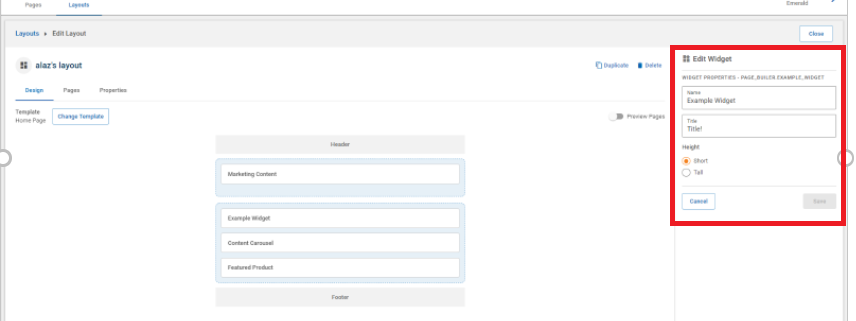
if (this.widgetType?.exampleWidgetType) { this.updateProperty("titleInput", this.titleInput.value); this.updateProperty("height", this.height.value); } - Save and close the file. The widget details pane appears in the
Widget tab of the
Layout section as shown in the image
below:
- layout-widget-details.json: This file has the
widget details defined and listed.