Commerce Composer widget architecture
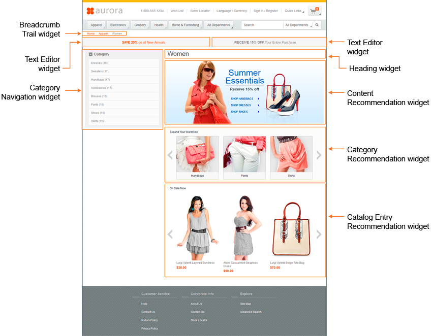
- Storefront components, which include a stand-alone, compilable JSP unit that retrieves and displays data on a store page. The JSP files can be customized to display differently and to display different content based on the configurable properties that are selected by business users. If the widget JSP files follow responsive web design patterns, the widget can also be used on store pages that display for any device class (mobile, tablet, desktop). The caching and performance of the widget in the storefront must also be a consideration when customizing the storefront components for a widget.
- Management Center components, which provide a properties view to business users. Users can select any configurable properties in this view to specify how the widget displays and what data the widget displays. The Commerce Composer tool, which is used to manage widgets, allows for easy saving and retrieval of widget property information. The widget properties and controls that business users configure are retrieved by the storefront components of the widget to determine the storefront display of the widget.
Site-level and store-level widgets
Before a widget can be used with the Commerce Composer tool, the widgets must be registered within the database for the Commerce Composer framework, Widgets can be registered for use at the site-level or store-level.- Site-level widgets
- Site-level widgets can be shared between stores. A widget can be registered at the site-level for use by all stores. By default, all Commerce Composer widgets are registered at the site-level. A store must subscribe to a site-level widget before the widget can be included on a page for that store.
- Store-level widgets
- Store level widgets are registered for use by a single store. The store must still subscribe to
a store-level widget to use the widget.
 Store level widgets can be registered
for use by a group of stores when the widget is registered for an asset store. By registering a
widget for an asset store, the widget is registered for all extended sites that use that asset
store. Also, if the asset store subscribes to the widget then the widget can be used by all of the
extended site stores. The widget is not available to stores that belong to a different asset store.
Store level widgets can be registered
for use by a group of stores when the widget is registered for an asset store. By registering a
widget for an asset store, the widget is registered for all extended sites that use that asset
store. Also, if the asset store subscribes to the widget then the widget can be used by all of the
extended site stores. The widget is not available to stores that belong to a different asset store.
Custom widget development
Widgets are composed of multiple components, including storefront and Management Center components. Your company can create custom widgets to add to the widget library by defining the storefront, Management Center, and data information for the widget. You must also use the Data Load utility to load the registration and subscription data for a widget. For more information about creating widgets, see Creating Commerce Composer widgets.
Your company can use widgets that are created by third-party vendors if the widgets are created to work with the Commerce Composer tool. To use a third-party widget, the widget must still be registered within the Commerce Composer framework and subscribed to by the store.
Storefront components
The storefront components of a widget consist of the top-level JSP file for the widget, the user interface providers, and a data provider. By defining the UI providers and data provider in separate files, there is a clear separation of data and presentation components for the widget. As a result, customizing or upgrading a widget is easier, and code is reused.
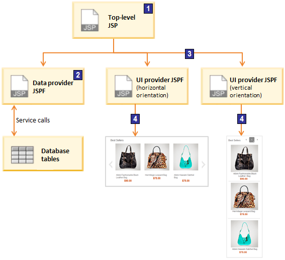
- 1 On the storefront, the top-level JSP file is called and runs. The definition of the widget within the top-level JSP file identifies the data provider and UI providers for the widget.
- 2 The top-level JSP file uses the data provider JSP fragment to retrieve data from the database by using data bean, service, or REST calls.
- 3 The top-level JSP file is used to determine the appropriate UI provider JSP fragment to render the data that is retrieved with the data provider. The widget definition can either set a UI provider or include logic so that Management Center users can select the UI provider.
- 4 The widget is rendered on the store page by using the selected UI provider.
- Top-level JSP
- The top-level JSP is called by the Commerce Composer framework to retrieve the widget content
and functionality when the widget is included on a store page. The JSP file defines the following
components and properties for a widget:
- Environment setup file
- Data provider
- UI providers and the logic that the Commerce Composer framework uses to select the UI provider
- Predefined properties
- Configurable properties that a Management Center user can set
- Default values for properties
When a store page is being rendered, the top-level JSP file of the widget is retrieved and used by a
wcpgl:widgetImporttag that is included in the store page. The top-level JSP for a widget is registered as a part of the widget definition with the HCL Commerce database. - Data provider
- A data provider file is a JSP fragment that defines how to retrieve the data that is required for the widget. Each widget must have only a single data provider file. The single data provider file for the widget is used with all of the UI provider files that are defined for the widget. The use of a single data provider file allows for multiple instances of a widget to contain the same data but be rendered differently.
- UI provider
- The UI provider file is a JSP fragment that defines how to render the data that is retrieved for
a widget. A widget can support multiple UI provider files so that the data for the widget can be
rendered in different ways. Each way that a widget can be rendered must be defined within a separate
UI provider file. For example, you can create a custom product recommendation widget that has two UI providers:
- Horizontal UI provider for rendering the widget horizontally
- Vertical UI provider for rendering the widget vertically
- Additional storefront components
- You can use CSS, images, and JavaScript to customize the functionality of a custom widget. The
CSS and images are specified with include statements in the top-level JSP file, while any JavaScript
files are identified within the definition XML.
- JavaScript files define the user actions that are included in the widget
- CSS defines any buttons, text boxes, or radio buttons that must display
Management Center components
- The widget name that identifies the widget in the current layout and explains how the widget is used. For example, you can use a widget to display a page banner image, clearance products area, and more.
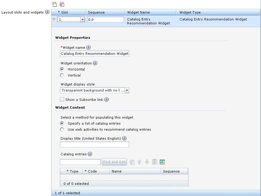
- The widget properties are optional name-value pair properties that are stored by the Commerce Composer framework within the PLWIDGETNVP database table. When a widget renders within a layout the value for properties are passed to the store JSP files to help determine how the widget displays.
- The widget content contains the optional properties for the widget, which are stored externally from the Commerce Composer framework. For example, some default-provided widgets create an e-Marketing Spot that displays default content or a web activity. These properties are not stored in the Commerce Composer framework, but the framework provides widget manager classes (mediators) that are used to save some marketing-related data.
For more information about the properties that are available and used for the widgets that are provided by default, see Commerce Composer widget properties.
- Widget object definition
- The object definition for the widget. The widget object definition is based on the
wcfWidgetObjectDefinition class, which is an extension of the
wcfChildObjectDefinition class. The
wcfWidgetObjectDefinition extends the
wcfChildObjectDefinition class to include the
WidgetDisplayGroupsandhelpLinkproperties. The wcfChildObjectDefinition class is a direct subclass of the wcfObjectDefinition class. The wcfWidgetObjectDefinition class, like the wcfChildObjectDefinition class, describes a business object. The widget object definition describes a widget business object and contains the metadata about the widget that is required by Management Center. - Properties view definition
- This file defines the widget properties that a Management Center user can set. A property can be used to retrieve data, determine rendering style, or provide general configuration of the widget.
- Page Layout properties file
- The PageLayoutLOB.properties file defines the text strings that are displayed in the properties view. Any translatable text for the widget is defined in separate store language-specific text properties files. This properties file is registered within the PageLayoutResourceBundle.lzx resource bundle. This resource bundle is included within the PageLayoutExtensionsLibrary.lzx resource bundle library.
Widget Manager
When the user adds a widget into a slot, the user can then
set the values for the configurable properties of the widget. When the user saves the property
settings, the values are saved with information to associate the widget and layout with property
value in the PLWIDGETNVP database table. Some configurable
properties must be saved in different database tables. A widget manager class is used to determine
how to save the property settings. The widget manager is also used to validate the settings and
retrieve the settings when the widget is being rendered on the storefront. When a user selects to
edit a widget within a layout, the ReadWidgetManager retrieves the widget
identifier information. Then, the widget manager retrieves the widget property settings that are
specific for the layout. The widget manager class is specified in the definition XML for a
widget.
If you are creating custom widgets that use marketing related data, you can use a provided widget manager class to save the data. If the provided widget manager classes do not save the data that your widget requires, you can create a custom widget manager class (mediator) to handle the data. For more information about the widget manager class, see Defining a Commerce Composer widget manager class.
Widget groups
- Widget display groups
- Used to organize widgets in the Commerce Composer tool to help Management Center users filter
the list of widgets. In Management Center, widgets display within the Add Widgets to
Slots window in the Commerce Composer tool. Management Center users can select a widget
from the Add Widgets to Slots window to add the widget to a layout template
slot. The Add Widgets to Slots window includes all of the widgets that a store
subscribes to and that are registered in the Commerce Composer framework. The widgets within this
window are also grouped into widget display groups to improve filtering for locating a widget. When
you create custom widgets, you can include the widgets within these default groups or create your
own groups. For example, if you add a page type to the Commerce Composer tool, you might want to
create a group for that page type. Your new group can include all of the widgets that a Management
Center user can add to layout template slots for that new page type. A widget can be included in multiple widget display groups. By default the following widget groups are available:
- AnyPage
- Set of widgets for use on any page.
- CategoryPage
- Set of widgets for use on category pages.
- CatalogEntryPage
- Set of widgets for use on catalog entry pages.
- SearchPage
- Set of widgets for use on a search results page.
Figure 4. Add Widgets to Slots window. The following image provides a sample view of the Add Widgets to Slots window with the drop-down list of the default widget display groups. 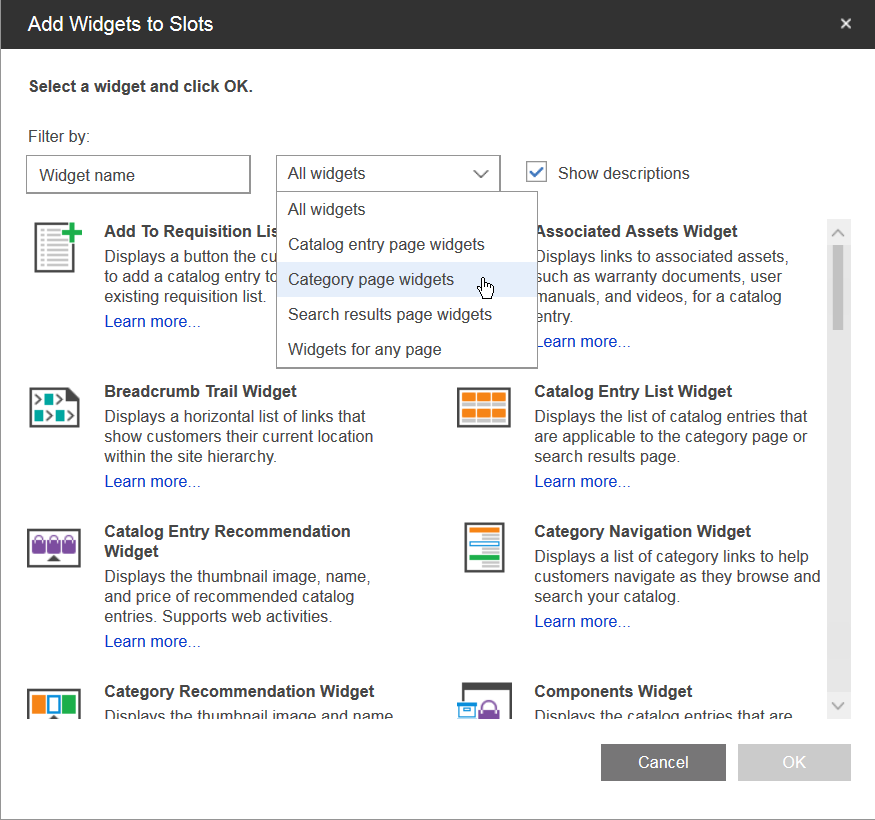
- Widget restriction groups
- Used to restrict the slots in layout templates to include only widgets from defined widget
groups. For example, in a layout template for a category page, you might want to restrict a slot in
the left sidebar to include only the Category Navigation and the Facet Navigation widgets. The
widget groups that are allowed to be included within a slot are defined in the PROPERTIES column of
the PLWIDGETSLOT. You can add a widget to a widget restriction
group by updating the definition XML for the widget. Administrators can use the Data Load utility to
update the definition XML and update the groups to which a widget belongs. A widget can be included in multiple widget restriction groups. By default however only the following widget group is used as a restriction group:
- WidgetForTabTitle
- Set of widgets for use as a tab title in a layout template that includes tabbed slots. This group name does not display in the Commerce Composer tool. This group is defined as only a widget restriction group. This group name is used to identify the widgets that can be included as a title for a layout template tabbed slot. When a user selects to include a widget within a slot that is restricted to this group, only the widgets within this group display as available. By default, only the Text Editor widget is included in this group. All layout templates that include tabbed slots, such as the Any page, eight slots, tabs layout template, restrict the tab titles to include only the widgets that belong to this group.
Responsive widgets
All of the widgets that are in the Commerce Composer widget library by default are responsive. Responsive widgets display according to device screen sizes. For example, the faceted navigation widget automatically expands as display sizes grow larger.
A responsive widget does not have a fixed width. When you place a responsive widget in a slot in a template, the widget width automatically adjusts to accommodate the content within the slot. Most responsive widgets do not have a fixed height. You can use responsive widgets in responsive layout templates, as well as desktop and mobile layout templates that contain fixed widths.
If you created a custom widget, you can make your widget responsive. For more information, see Creating a responsive widget.
For more information about responsive widgets, see Responsive widgets.
Caching
The widgets for your store and site can be cached to improve storefront performance. Every widget that is provided by default has a cachespec.xml file entry that sets the caching parameters for the widget. However, not all widgets are cached by default. Whether a widget is cached, and how the widget is cached depends on the widget functionality. For more information about caching Commerce Composer widgets, see Commerce Composer widget caching and invalidation.