Creating responsive marketing content
You can create responsive marketing content so that they are optimized for web browsers on desktop, tablet, and mobile devices.
Responsive marketing content includes live image and text layers that, unlike flat images, can adapt to different viewport dimensions.
Making marketing content responsive enables them to be served on different devices or view ports without losing fidelity.
Procedure
- The following are a list of general style guidelines:
- Use HTML to layer the images and text instead of flattening them into a single image.
- Position and scale images by using CSS in response to different viewport widths.
- Use CSS media queries to conditionally load smaller images on mobile device.
- Adjust font sizes by using CSS media queries and allow text blocks to flow naturally so that they can re-flow or re-wrap in response to smaller viewport widths.
- Provide alternatives or replacements to all Flash animations and videos, such as static images, HTML animations, and videos, as many mobile devices do not support Flash.
- Optimize images to conserve bandwidth and reduce download time, especially on mobile devices.
-
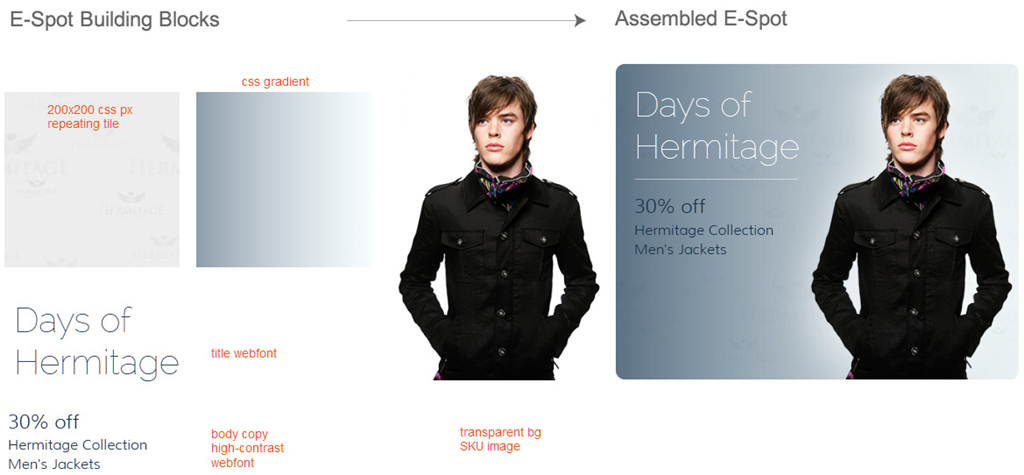
An example of how responsive marketing content can be composed is as follows.

Where:- The E-Marketing Spot content is constructed by using a multi-layer structure (continuous repeating tile background that is separated from the foreground subject image. This is typically in transparent PNG format.
- Additional procedural/CSS-based layers with transparent gradients exist for additional visual treatment options. This allows for highly adjustable container geometry or aspect ratio changes.
- The following are a list of alternative approaches for
responsive marketing content:
- Create device-specific layouts with different marketing content tailored for different devices.
- The default content recommendation widget scales unresponsive marketing content (flat images) to fit the slot's width, to a maximum of 100%.
- Third-party client and server-side solutions are available that fetch or serve images and videos based on viewport width or the browser's user agent.