Inputs
- Input.Text – Properties:
- isMultiLine: If the value is true, this property will allow multiple lines of input then. It is of type Boolean and not a required property.
- maxLength: This property will specify maximum length of characters in an input. It is of type Number.
- Placeholder: It specify the description of the input. It is of type string.
- Regex: Regular expression indicating the required format of this text input.
- Style: It specify the style for text input. Allowed values are text, tel, url, email and password.
- inlineAction: The inline action for the input. Typically displayed to the right of the input. It is strongly recommended to provide an icon on the action (which will be displayed instead of the title of the action). It is of type ISelectAction. Allowed values are Action.Execute, Action.OpenURL, Action.Submit, and Action.ToggleVisibility
- value: It specifies the initial value for the field. It is of type string.
- Id: Unique identifier for the value. Used to identify collected input when the Submit action is performed. It is of type string and a required property.
- errorMessage: Error message to display when entered input is invalid. It is of type string.
- isRequired: Whether or not this input is required. It is of type Boolean.
- Label: It specifies the label for the input. It is of type string.
- Fallback: It will tell what to do when an unknown element is encountered or the requires of this or any children can't be met. It is not a required value. It is of type Element and Fallback Option. It is supported in version 4.2. Allowed values are ActionSet, ColumnSet, Container, FactSet, Image, ImageSet, Input.ChoiceSet, Input.Date, Input.Number, Input.Text, Input.Time, Input.Toggle, Media, RichTextBlock, Table, TextBlock and drop (Causes this element to be dropped immediately when unknown elements are encountered. The unknown element doesn't bubble up any higher.)
- Height: Specifies the height of the element. Allowed values are auto and stretch.
- Separator: If true, draw a separating line at the top of the element. It is of type Boolean.
- Spacing: It controls the amount of spacing between this element and the preceeding element. It is of type Spacing. Allowed values are default, none, small, medium, large, extra-large, and padding.
- isVisible: If false, then this item will be removed from the visual tree. It is of type Boolean.
- Example:
Figure 1. Figure 382 – Example Code (Input.Text) 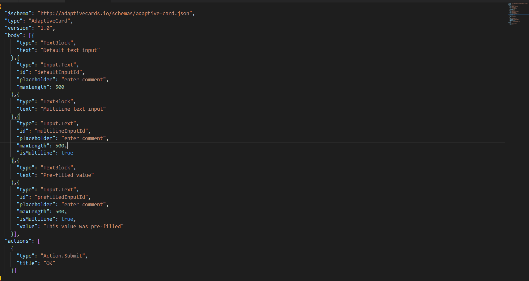
- Input.Number – Properties:
- Max: It specifies the maximum value of Input. It is of type Number.
- Min: It specifies the minimum value of Input. It is of type Number.
- Placeholder: It specify the description of the input. It is of type string.
- value: It specifies the initial value for the field. It is of type string.
- Id: Unique identifier for the value. Used to identify collected input when the Submit action is performed. It is of type string and a required property.
- errorMessage: Error message to display when entered input is invalid. It is of type string.
- isRequired: Whether or not this input is required. It is of type Boolean.
- Label: It specifies the label for the input. It is of type string.
- Fallback: It will tell what to do when an unknown element is encountered or the requires of this or any children can't be met. It is not a required value. It is of type Element and Fallback Option. It is supported in version 4.2. Allowed values are ActionSet, ColumnSet, Container, FactSet, Image, ImageSet, Input.ChoiceSet, Input.Date, Input.Number, Input.Text, Input.Time, Input.Toggle, Media, RichTextBlock, Table, TextBlock and drop (Causes this element to be dropped immediately when unknown elements are encountered. The unknown element doesn't bubble up any higher.)
- Height: Specifies the height of the element. Allowed values are auto and stretch.
- Separator: If true, draw a separating line at the top of the element. It is of type Boolean.
- Spacing: It controls the amount of spacing between this element and the preceeding element. It is of type Spacing. Allowed values are default, none, small, medium, large, extra-large, and padding.
- isVisible: If false, then this item will be removed from the visual tree. It is of type Boolean.
- Example:
Figure 2. Figure 383 – Example Code (Input.Number) 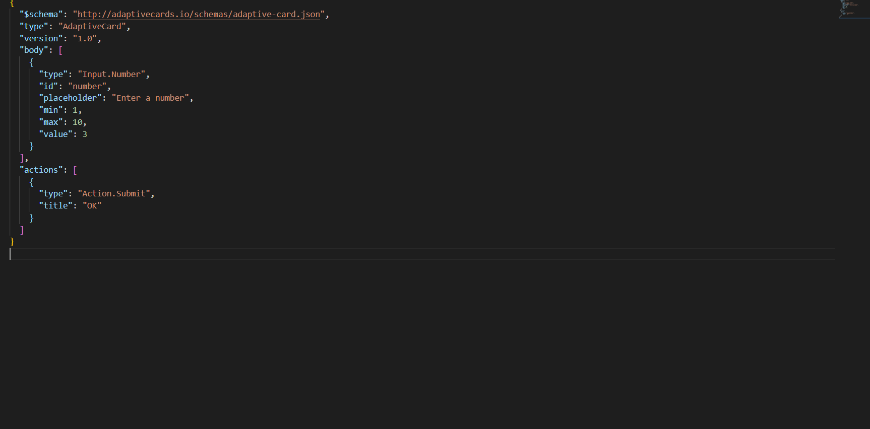
- Input.Date – Properties:
- Max – It specify the maximum value expressed in YYYY-MM-DD. It is of type string.
- Min: It specifies the minimum value expressed in YYYY-MM-DD. It is of type string.
- Placeholder: It specify the description of the input. It is of type string.
- value: It specifies the initial value for the field. It is of type string.
- Id: Unique identifier for the value. Used to identify collected input when the Submit action is performed. It is of type string and a required property.
- errorMessage: Error message to display when entered input is invalid. It is of type string.
- isRequired: Whether or not this input is required. It is of type Boolean.
- Label: It specifies the label for the input. It is of type string.
- Fallback: It will tell what to do when an unknown element is encountered or the requires of this or any children can't be met. It is not a required value. It is of type Element and Fallback Option. It is supported in version 4.2. Allowed values are ActionSet, ColumnSet, Container, FactSet, Image, ImageSet, Input.ChoiceSet, Input.Date, Input.Number, Input.Text, Input.Time, Input.Toggle, Media, RichTextBlock, Table, TextBlock and drop (Causes this element to be dropped immediately when unknown elements are encountered. The unknown element doesn't bubble up any higher.)
- Height: Specifies the height of the element. Allowed values are auto and stretch.
- Separator: If true, draw a separating line at the top of the element. It is of type Boolean.
- Spacing: It controls the amount of spacing between this element and the preceeding element. It is of type Spacing. Allowed values are default, none, small, medium, large, extra-large, and padding.
- isVisible: If false, then this item will be removed from the visual tree. It is of type Boolean.
- Example:
Figure 3. Figure 384 – Example Code (Input.Date) 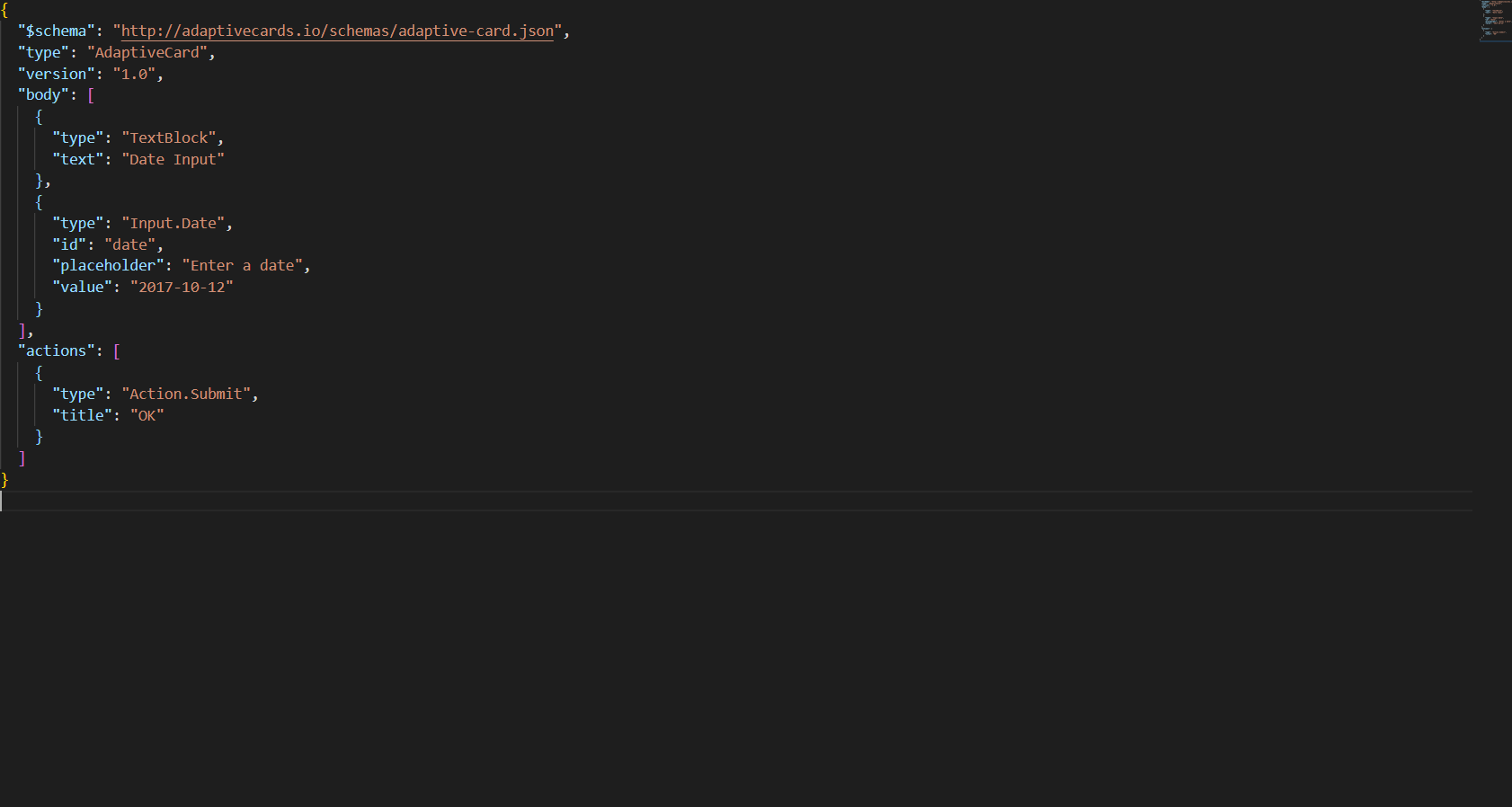
- Input.Time – Properties:
- Max: It specify maximum value expressed in HH: MM. It is of type string.
- Min: It specifies the minimum value expressed in YYYY-MM-DD. It is of type string.
- Placeholder: It specify the description of the input. It is of type string.
- value: It specifies the initial value for the field. It is of type string.
- Id: Unique identifier for the value. Used to identify collected input when the Submit action is performed. It is of type string and a required property.
- errorMessage: Error message to display when entered input is invalid. It is of type string.
- isRequired: Whether or not this input is required. It is of type Boolean.
- Label: It specifies the label for the input. It is of type string.
- Fallback: It will tell what to do when an unknown element is encountered or the requires of this or any children can't be met. It is not a required value. It is of type Element and Fallback Option. It is supported in version 4.2. Allowed values are ActionSet, ColumnSet, Container, FactSet, Image, ImageSet, Input.ChoiceSet, Input.Date, Input.Number, Input.Text, Input.Time, Input.Toggle, Media, RichTextBlock, Table, TextBlock and drop (Causes this element to be dropped immediately when unknown elements are encountered. The unknown element doesn't bubble up any higher.)
- Height: Specifies the height of the element. Allowed values are auto and stretch.
- Separator: If true, draw a separating line at the top of the element. It is of type Boolean.
- Spacing: It controls the amount of spacing between this element and the preceeding element. It is of type Spacing. Allowed values are default, none, small, medium, large, extra-large, and padding.
- isVisible: If false, then this item will be removed from the visual tree. It is of type Boolean.
- Example:
Figure 4. Figure 385 – Example Code (Input.Time) 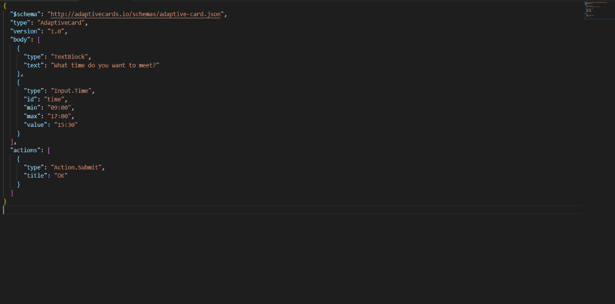
- Input.Toggle – Properties:
- Title: It will specify the title of the toggle and of type string. Default value is false.
- Value: It specifies the initial selected value. If you want the toggle to be initially on, set this to the value of valueOn’s value.
- valueOff: This is the value when the toggle is off. It is of type string. Default value is false.
- valueOn: This is the value when the toggle is on. It is of type string. Default value is true.
- Wrap: If the property is set to true, it will wrap the value otherwise the text is clipped. It is of type Boolean.
- Id: Unique identifier for the value. Used to identify collected input when the Submit action is performed. It is of type string and a required property.
- errorMessage: Error message to display when entered input is invalid. It is of type string.
- isRequired: Whether or not this input is required. It is of type Boolean.
- Label: It specifies the label for the input. It is of type string.
- Fallback: It will tell what to do when an unknown element is encountered or the requires of this or any children can't be met. It is not a required value. It is of type Element and Fallback Option. It is supported in version 4.2. Allowed values are ActionSet, ColumnSet, Container, FactSet, Image, ImageSet, Input.ChoiceSet, Input.Date, Input.Number, Input.Text, Input.Time, Input.Toggle, Media, RichTextBlock, Table, TextBlock and drop (Causes this element to be dropped immediately when unknown elements are encountered.)
- Height: Specifies the height of the element. Allowed values are auto and stretch.
- Separator: If true, draw a separating line at the top of the element. It is of type Boolean.
- Spacing: It controls the amount of spacing between this element and the preceeding element. It is of type Spacing. Allowed values are default, none, small, medium, large, extra-large, and padding.
- isVisible: If false, then this item will be removed from the visual tree. It is of type Boolean.
- Example:
Figure 5. Figure 386 – Example Code (Input.Toggle) 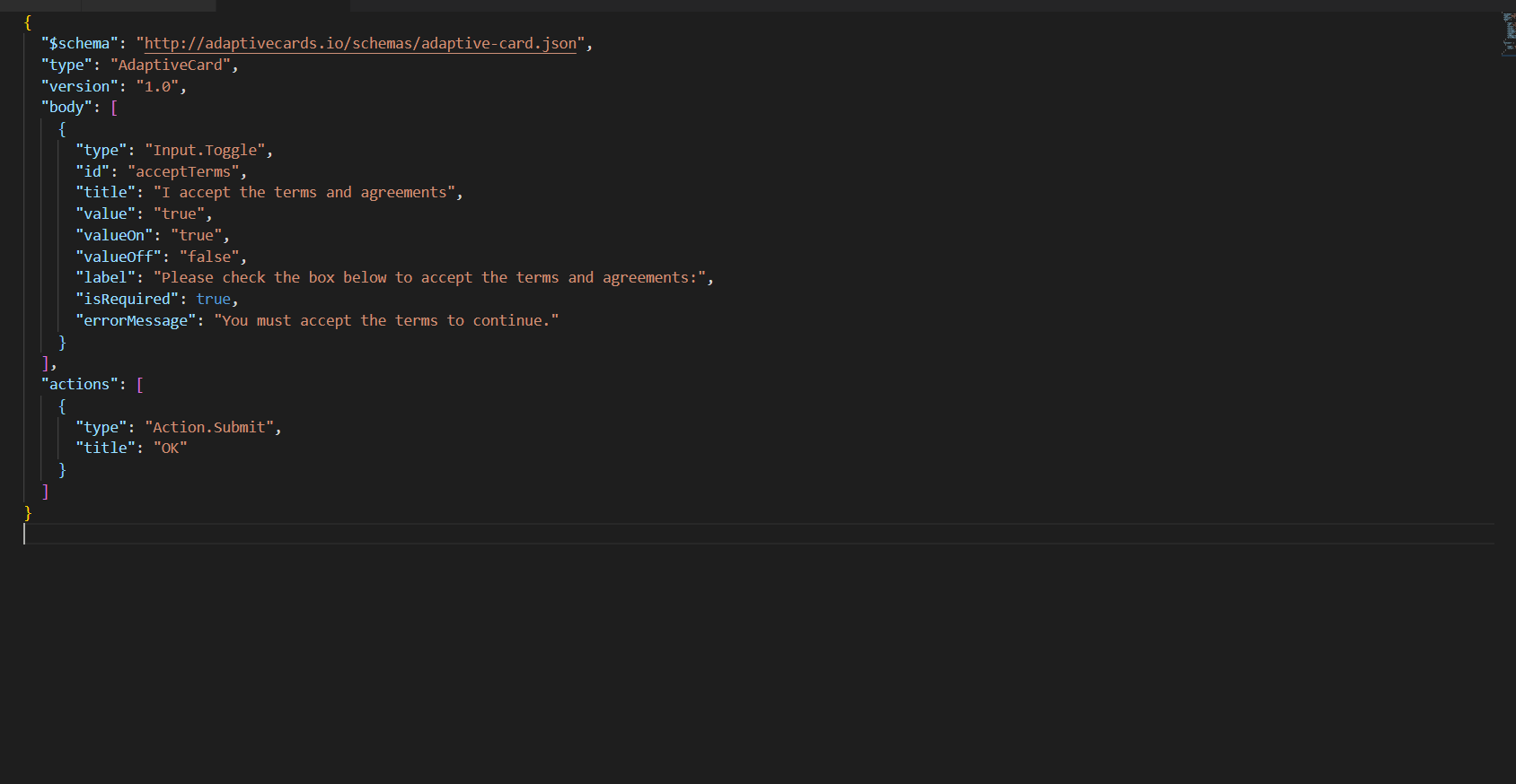
- Input.ChoiceSet – Properties:
- Choices: It provides the options to select. It is of type Input.Choice[]. Allowed values are Input.Choice
- isMultiSelect: Allow multiple choices to be selected.
- It is of type boolean.
- Placeholder: It specify the description of the input. It is of type string. Only visible when no selection is made, the style is compact and isMultiSelect is false.
- value: It specifies the initial value for the field. It is of type string. For multi-select, specify a comma separated string of values.
- Id: Unique identifier for the value. Used to identify collected input when the Submit action is performed. It is of type string and a required property.
- errorMessage: Error message to display when entered input is invalid. It is of type string.
- isRequired: Whether or not this input is required. It is of type Boolean.
- Label: It specifies the label for the input. It is of type string.
- Fallback: It will tell what to do when an unknown element is encountered or the requires of this or any children can't be met. It is not a required value. It is of type Element and Fallback Option. It is supported in version 4.2. Allowed values are ActionSet, ColumnSet, Container, FactSet, Image, ImageSet, Input.ChoiceSet, Input.Date, Input.Number, Input.Text, Input.Time, Input.Toggle, Media, RichTextBlock, Table, TextBlock and drop (Causes this element to be dropped immediately when unknown elements are encountered.)
- Height: Specifies the height of the element. Allowed values are auto and stretch.
- Separator: If true, draw a separating line at the top of the element. It is of type Boolean.
- Spacing: It controls the amount of spacing between this element and the preceeding element. It is of type Spacing. Allowed values are default, none, small, medium, large, extra-large, and padding.
- isVisible: If false, then this item will be removed from the visual tree. It is of type Boolean.
- Style: It specifies the style of the ChoiceSet. It is of type ChoiceInputStyle. Allowed values are compact, expanded and filtered.
- Wrap: If property value is true, it will wrap the text otherwise the text is clipped. It is of type boolean.
- Example:
Figure 6. Figure 387 – Example Code (Input.ChoiceSet) 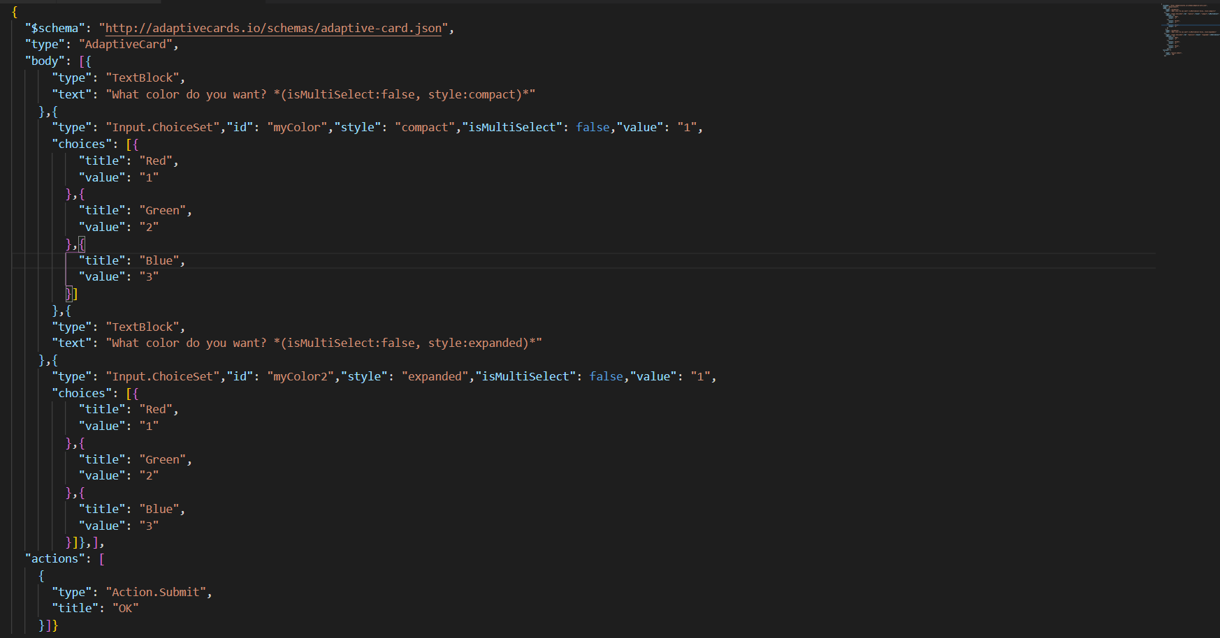
- Input.Choice – Properties:
- Title: It is the text to display and is of type string. It is a required value.
- Value: It specifies the raw value for the choice. It is of type string.
Do not use comma (,) in the value.