In this lesson, you update your new custom widget
to follow responsive web design. By making your widget responsive,
the size of your widget adapts depending on the device that is being
used to view the page that contains your widget. By using a responsive
web design (RWD) approach, you can design one widget and define how
the widget appears on different devices instead of creating multiple
widgets for different-sized devices. When you are creating a custom
widget, make your widget responsive so that the widget can be used
in layouts for any type of device class.By default, all
of the widgets that are provided with WebSphere Commerce are responsive.
For more information about these widgets, see Responsive widgets.
Configure your web browser so that you can select to view your
store for different device classes.
About this task
Aurora starter store pages are responsive by design so
that they can be accessed across multiple channels and platforms.
RWD pages in WebSphere Commerce use fluid layouts that include percentage-based
widths for the layout template slots. The responsive pages dynamically
resize to show content on the different devices that shoppers can
use to access a store. For example, a store can show various page
sizes or layouts according to the screen size of the device the shopper
is using to view the store. These responsive pages demonstrate the
best practices for store development within WebSphere Commerce. You
can use these responsive pages to help you implement a responsive
storefront for your site that can be used for various platforms. For
more information about the RWD approach in WebSphere Commerce, see Responsive Web Design (RWD).
By default, the responsive pages for WebSphere Commerce adapt to fit three device screen size
ranges. The default page ranges are defined as range breakpoints by using CSS3 Media Query
declarations. You can review these breakpoint declarations within the following CSS file
WC_eardir/Stores.war/storedir/css/styles.css.
The
following table summarizes the default page ranges for the Aurora
starter store that are declared in the styles.css file:
Aurora starter store page ranges
Device
Range breakpoint
Page range
Desktop
RWD-C
1281 CSS pixels and above
Tablet
RWD-B
601 - 1280 CSS pixels
Mobile
RWD-A
600 CSS pixels and below
The current starter store-supported web browsers understand
the CSS3 Media Query declarations, and update the rendering of store
content and layout flows. For example, when you manually resize a
browser window or change the screen resolution on your desktop, the
browser understands the change. The store page then responds to the
change and adapts to use the appropriate layout flows and widget and
content sizes. The fallback for unsupported browsers displays the
desktop site. For more information about the page ranges and the response
of starter store pages to different devices and screen sizes, see
To make your widget responsive, you must define how your
widget is to display at the different page range breakpoints. For
more information about updating a widget to be responsive, see Creating responsive widgets.
By
default, the Shopping Cart page is partially
responsive. After you customize your custom widget to be responsive
and include the widget as part of a responsive layout, the Shopping
Cart page becomes responsive. Along with the inclusion
of your newly responsive widget, the Shopping Cart page
includes the following responsive components:
The layout template, Any page, five slots, right sidebar that
this tutorial uses is a responsive template. The template slots within
the template include flexible heights and widths that adjust according
to changes in the page range.
Along with the updates you complete to make your widget responsive,
the ShoppingCartDetailWidget widget inherits
default JSP and CSS code. This default code also follows a responsive
design approach to support a fluid layout system with flexible percentage-based
widths.
The other Commerce Composer widgets (Header widget, Footer widget,
and Catalog Entry Recommendation widget) that you included within
the layout for the Shopping Cart page are responsive
widgets.
With the Shopping Cart page responsive,
when you resize your browser the widgets on the page shift to the
left to stack vertically. For instance, the catalog entry recommendation
widget on the page moves under the ShoppingCartDetailWidget so
that a shopper can view the entire page easily on a mobile or tablet
device.
Note: By creating a responsive layout for the Shopping
Cart page that contains only responsive widgets, you are
making the Shopping Cart page responsive.
Procedure
Review how the Shopping Cart page
and your custom widget behave at different page range breakpoints.
In a desktop web browser that is set to the RWD-C breakpoint,
go to your Aurora store home page. You can launch your store from
the Store Management tool in Management Center.
For more information, see Selecting and viewing stores.
Browse your store and add a product to your Shopping
Cart. Go to your Shopping Cart page.
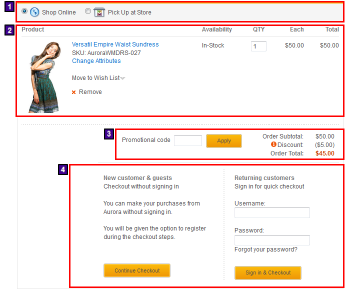
Your ShoppingCartDetailWidget can
resemble the following image:
The ShoppingCartDetailWidget widget is composed
of four sections:
1 - Shipping mode selection options,
which include the options to Shop Online or Pick
Up at Store.
2 - Order item details, which include
the list of products, availability, quantity, price per unit, and
total price.
3 - Single shipment order totals
summary, which includes subtotal and order calculations, and the Promotional
code entry field.
4 - Checkout logon section, which
shoppers use to sign in or select to checkout without signing in.
Manually resize your web browser to the RWD-A breakpoint.
Examine how each section responds to the change in page range.
1 - The shipping mode selection section
is not affected by the change. The section does not require updates
as the section contains only a small amount of information and still
displays correctly even when you resize the page to 300 CSS pixels.
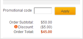
3 - The single shipment order totals
summary section is responsive by default. When you continue resize
your browser to a smaller CSS pixel size, the subtotal and order total
calculations shift below the Promotional code entry
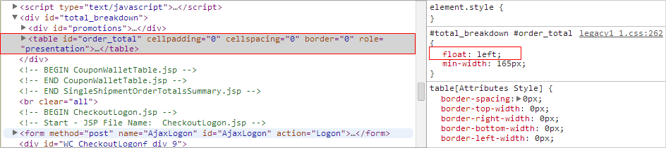
field. Right-click within this section of the page and select to view
the source code for the section. The section is defined as a table within the JSP code. The CSS
sets the placement of the content within the table to always float
to the left of the table when the browser window shrinks in size.
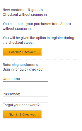
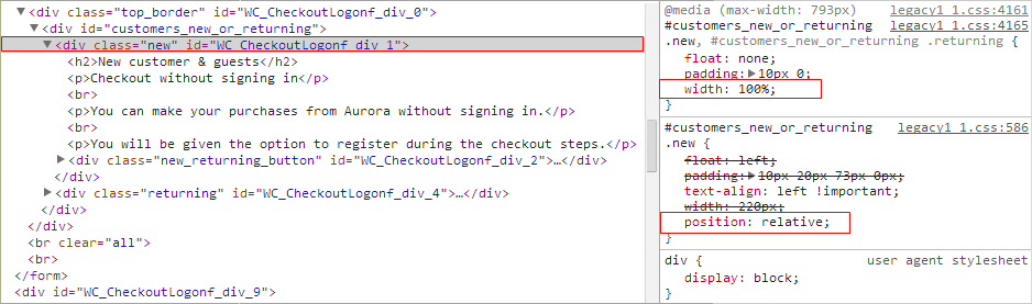
4 - The checkout logon section is
also responsive by default. When you resize your browser window, the
content within the section automatically adjusts to fit within the
changed dimensions. Right-click within this section of the page and select to view
the source code for the section. Within the CSS code, the width and position of the section is
percentage-based and relative. When you resize your browser, the storefront
dynamically adjusts the layout and placement of the page components,
including this check out logon section.
2 - The order item details section,
which is defined as a fixed table and is not responsive by default.
When you adjust the width of your browser to the smaller breakpoint
and lower, the table columns shrink and no longer display correctly.
Right-click within the section of the page and select to the view
the source code the section. You can see from the code that the order
item details section is defined within the OrderItemDetail.jsp file.
The corresponding CSS file is common1_1.css file.
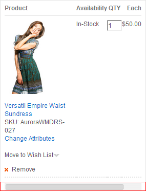
In the following steps, you add a scroll bar for this table to make
the order item details section responsive. This scroll bar displays
when the order item details section is viewed at a smaller breakpoint
so that shoppers can view the order item details content properly.
Save and close the file. The code that you included
adds a percentage width and sets the overflow to scroll.
Verify that the order item details section is responsive
within your store.
In a desktop web browser that is set to the RWD-C breakpoint,
go to your Aurora store home page.
Resize your browser window to below the RWD-A breakpoint.
Ensure that the scroll bar for the order item details section displays.
The updated order item detail section of your custom widget
can resemble the following image at 300 CSS pixels.
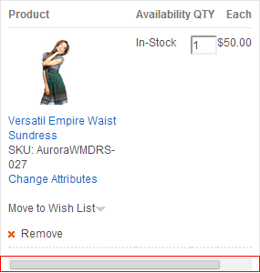
Update the css for the image that displays within the order
item details section to resize at different page break
Right-click within the order item details section and
select to view the source code for the section. Within the source
code, you can see that the size of the image that displays for the
order item is defined within the legacy1_1.css CSS
file.
In the Enterprise Explorer view of WebSphere Commerce
Developer, go to the Stores\WebContent\Aurora\css directory.
You can also update the display size of other
attributes for the order item details section within the file.
Save and close the file.
In your web browser, refresh the Shopping
Cart page. Ensure that the image size responds to the change
in page size when you resize your browser.
At 300 CSS pixels,
the order item detail section of your custom widget can resemble the
following image.
Results
You widget is updated to be responsive when shoppers are using
different devices to view a store page that contains your widget.
You have also updated the Shopping Cart page
layout to be responsive by ensuring the layout includes only responsive
widgets.