Examples: Adding Management Center properties view widgets
| Properties view widget | Description |
|---|---|
| 1 Input text property | User can type text in an entry field. Example: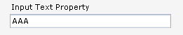 |
| 2 Radio group property | User can choose one option from a series of mutually exclusive options.
Example: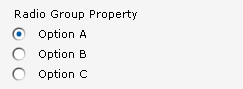 |
| 3 Stepper property | User can step up or down through a series of numerical values within a set
range. Example: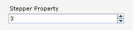 |
| 4 Input text property (required) | Same as Input text property, except that a red asterisk is included on the
widget label, and red validation messages display until the user enters a valid value.
Example: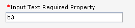 |
| 5 Combination box property | User can choose from a drop-down list of selectable options. Example: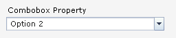 |
| 6 Check box property | User can toggle between a true value and a false value. Example: |
- A required field
- You can set any property to be required. As a result, Management Center displays validation messages for the property until the user completes the property. For an example, see the property that is labeled with the callout 4 (Input Text Required Property).
- Enablement conditions
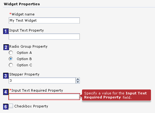
- You can set enablement conditions for a property. As a result, the property is displayed to the user only when certain conditions are met, for example, a specific radio button is selected in another property. For examples of properties that are controlled by an enablement condition, see the properties that are labeled with the callouts 3 (Stepper Property), 4 (Input Text Required Property), and 5 (Combobox Property).
For a list of the available properties view widgets, see Creating widgets in Management Center.
Example properties view
The sample code creates the following properties view, which contains the six types of properties view widgets that are listed in the previous table. Figures 1 to 4 show how certain properties are displayed and hidden when the user selects different options from the Radio Group Property. This behavior is controlled by enablement conditions that are defined in the properties view definition. Figures 3 and 4 show the behavior of a validation message for a required field.
| Properties view screen captures | |
|---|---|
|
The Combobox Property and Checkbox Property (5 and 6) are displayed. 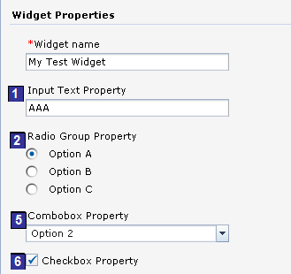 |
As in Figure 1, the Combobox Property and Checkbox Property (5 and 6) are displayed. 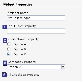
|
|
As a result:
 |
As a result, the validation messages are cleared. 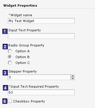
|
Object definition code sample
2
<!-- The xWidgetProp_testWidgetRadioGroupProperty property has 3 values: optionA, optionB, optionC -->
<PropertyDefinition propertyName="xWidgetProp_testWidgetRadioGroupProperty">
	<PropertyValue displayName="${mycompanyPageLayoutResources.testWidgetRadioGroupProperty_optionA}" value="optionA" />
	<PropertyValue displayName="${mycompanyPageLayoutResources.testWidgetRadioGroupProperty_optionB}" value="optionB" />
	<PropertyValue displayName="${mycompanyPageLayoutResources.testWidgetRadioGroupProperty_optionC}" value="optionC" />
</PropertyDefinition>

3
<!-- The xWidgetProp_testWidgetStepperProperty property is an integer, range is from 1 to 2147483647 -->
<PropertyDefinition propertyName="xWidgetProp_testWidgetStepperProperty"
	maxValue="2147483647"
	minValue="1"
	type="integer">
</PropertyDefinition>

4
<!-- The xWidgetProp_testWidgetInputTextRequiredProperty is a required property -->
<PropertyDefinition propertyName="xWidgetProp_testWidgetInputTextRequiredProperty"
	required="true"
	displayName="${mycompanyPageLayoutResources.testWidgetInputTextRequiredPropertyPrompt}">
	<EnablementCondition conditionId="testWidgetPropertyGroup1Condition"
		propertyName="xWidgetProp_testWidgetRadioGroupProperty" enablementValue="optionB" />
</PropertyDefinition>

5
<!-- The xWidgetProp_testWidgetComboboxProperty property has 3 values: 1, 2, 3 -->
<PropertyDefinition propertyName="xWidgetProp_testWidgetComboboxProperty">
	<PropertyValue displayName="${mycompanyPageLayoutResources.testWidgetComboboxPProperty_option1}" value="1" />
	<PropertyValue displayName="${mycompanyPageLayoutResources.testWidgetComboboxPProperty_option2}" value="2" />
	<PropertyValue displayName="${mycompanyPageLayoutResources.testWidgetComboboxPProperty_option3}" value="3" />
</PropertyDefinition>

<Xml name="template">
	<xWidgetProp_testWidgetRadioGroupProperty>optionA</xWidgetProp_testWidgetRadioGroupProperty>
	<xWidgetProp_testWidgetStepperProperty>4</xWidgetProp_testWidgetStepperProperty>
	<xWidgetProp_testWidgetComboboxProperty>1</xWidgetProp_testWidgetComboboxProperty>
	<xWidgetProp_testWidgetCheckboxProperty>false</xWidgetProp_testWidgetCheckboxProperty>
	<sequence>0</sequence>
</Xml>
Properties view definition code sample
The following code snippet is from the properties view definition for the properties view shown in figures 1 to 4. The numbered callouts indicate the properties view widget that the code references.
<PropertyGroup name="widgetProperties" collapsable="false" groupTitle="${PageLayoutResources.widgetPropertiesPrompt}">
<PropertyInputText name="${PageLayoutResources.widgetNamePrompt}" propertyName="widgetName"
	promptText="${PageLayoutResources.widgetNamePrompt}" />

1
<!-- Use Input Text -->
<PropertyInputText propertyName="xWidgetProp_testWidgetInputTextProperty"
	promptText="${mycompanyPageLayoutResources.testWidgetInputTextPropertyPrompt}" />

2
<!-- Use RadioGroup-->
<PropertyRadioGroup propertyName="xWidgetProp_testWidgetRadioGroupProperty"
	promptText="${mycompanyPageLayoutResources.testWidgetRadioGroupPropertyPrompt}" />

<!-- This property group will be enabled when the value of xWidgetProp_testWidgetRadioGroupProperty property is optionB -->
<PropertyGroup name="testWidgetPropertyGroup1" collapsable="false">
	<EnablementCondition conditionId="testWidgetPropertyGroup1Condition"
		propertyName="xWidgetProp_testWidgetRadioGroupProperty" enablementValue="optionB" />

3
	<!-- Use Stepper -->
	<PropertyStepper propertyName="xWidgetProp_testWidgetStepperProperty"
		minimumValue="1"
		promptText="${mycompanyPageLayoutResources.testWidgetStepperPropertyPrompt}" />

4
	<!-- Use Input Text: required property -->
	<PropertyInputText propertyName="xWidgetProp_testWidgetInputTextRequiredProperty"
		required="true"
		promptText="${mycompanyPageLayoutResources.testWidgetInputTextRequiredPropertyPrompt}" />
</PropertyGroup>

<!-- This property group will be enabled when the value of xWidgetProp_testWidgetRadioGroupProperty property is optionA or optionC -->
<PropertyGroup name="testWidgetPropertyGroup2" collapsable="false">
	<EnablementOrCondition conditionId="testWidgetPropertyGroup2Condition">
		<EnablementCondition propertyName="xWidgetProp_testWidgetRadioGroupProperty" enablementValue="optionA" />
		<EnablementCondition propertyName="xWidgetProp_testWidgetRadioGroupProperty" enablementValue="optionC" />
	</EnablementOrCondition>

5
	<!-- Use Combobox -->
	<PropertyCombobox propertyName="xWidgetProp_testWidgetComboboxProperty"
		promptText="${mycompanyPageLayoutResources.testWidgetComboboxPropertyPrompt}" />
</PropertyGroup>

6
<!-- Use Checkbox -->
<PropertyCheckbox propertyName="xWidgetProp_testWidgetCheckboxProperty"
	text="${mycompanyPageLayoutResources.testWidgetCheckboxPropertyPrompt}" />
</PropertyGroup>