The following figure shows how a check box widget appears on a
transformation, using the data from the input field of the Input field with hints component example as input:
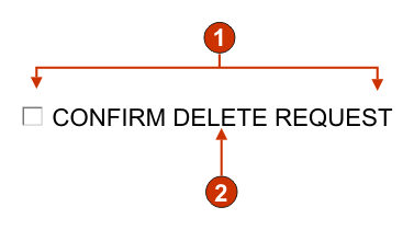
Figure 1. Check
box widget example
Number of columns per row (1)
Caption (from component)
The following settings can be configured for this widget:
Selected value
Required. The string that is inserted in the host screen input
field when the check box is selected. This value is also used to set
the initial state of the check box when the Web page is loaded.
Deselected value
Required. The string that is inserted in the host screen input
field when the check box is deselected. This value is also used to
set the initial state of the check box when the Web page is loaded.
Caption source
Specifies how the caption for the generated check box is determined.
Options: From component (use
the extracted caption from the component) or Custom (use the specified caption).
Custom caption
Optional. Specifies the caption for the check box.
Note: Leave
this setting blank to not generate a caption for the check box.
Trim spaces on caption
If selected, white space (extra space) is trimmed from both
ends of the caption.
Number of columns per row
The number of check boxes to display horizontally before wrapping
to the next line.
Note:
This setting is not applicable in default rendering.
The widget preview does not always match the full page preview. This happens
because the widget preview simply renders the component's output. It does not
try to preserve the alignment of the screen when it renders, as is done in the
full page preview.
Check box style class (Web-only)
Optional. The CSS style class associated with the generated
check box. The value of the class attribute of the HTML input tag
will be set to this value. The default value is HATSCHECKBOX. See Using style sheets for more
information.
Caption style class (Web-only)
Optional. The CSS style class associated with the caption of
the generated check box. The default value is HATSCAPTION.
See Using style sheets for more information.
Table style class (Web-only)
Optional. The CSS style class associated with the generated
table. If more than one check box is rendered, an HTML table will
be generated to enclose these check boxes. The value of the class
attribute of the HTML table tag will be set to this value. The default
value is HATSTABLE. See Using style sheets for more information.
Style (Web-only)
Optional. Any CSS properties that you want to override. For
example, you can specify font-color:
red; font-size: 18pt; in this field to change the font color
and size for this widget. The properties you enter apply to each element
of this widget. Use the launcher
button next to this field to open a style properties dialog. This
dialog frees you from the need to understand CSS to change the font,
color, or other style settings for the widget. See Using style sheets for more information.
Have feedback?
Google Analytics is used to store comments and ratings. To provide a comment or rating for a topic, click Accept All Cookies or Allow All in Cookie Preferences in the footer of this page.