The light pen (selection) component is responsible for recognizing
a light pen (also known as selector pen) selection field on
3270 host screens.
Note: This component does not appear
in the ZIETrans Components section in the Palette view
of the Rich Page Editor. If
light pen support was enabled by selecting the Add
light pen rendering support check box during the initial creation
of a 3270 or 3270E project, this component is accessible from the Eclipse menu
bar by clicking ZIETrans Tools > Insert
Host Component.
A recognized light pen selection field can be rendered by the Check box widget.
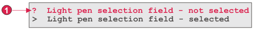
If the designator character (the first character of the field)
is a question mark (?), the rendered check box is not selected. If
the designator character is a greater-than sign (>), the rendered
check box is selected.
The following figure shows how a light pen (selection) component
might appear on your host screen:
Figure 1. Light pen (selection) component
example
Designator character (the first character of the field)
The following settings can be configured for this component:
Consume remainder of field
Specifies whether the entire field or just the first character
of the field is consumed and rendered by the widget. Select this check
box to specify that the entire field is consumed and rendered. For
example, the contents of the field are rendered as the caption of
the rendering widget (check box). Clear this check box to specify
that only the first character will be rendered by the widget. This
is useful to preserve colors or extended attributes in the remainder
of the field. When in Default Rendering, clearing this check box will
cause the remainder of the field (everything except for the first
character of the field) to be rendered by some other widget (in most
cases by the Field widget). The default is selected.
Have feedback?
Google Analytics is used to store comments and ratings. To provide a comment or rating for a topic, click Accept All Cookies or Allow All in Cookie Preferences in the footer of this page.