The Dialog widget is responsible for rendering dialog boxes. It
renders data supplied by the Dialog component.
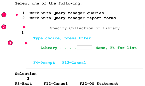
The following figure shows how a Dialog widget appears
on a transformation using the data from the Dialog component example
as input:
Figure 1. Dialog widget example
Disabled area
Specialized border
Border characters removed
The following settings can be configured for this widget:
Hide disabled area outside dialog
Specifies whether to hide the area outside of the dialog.
Disabled area style class (Web-only)
Specifies the CSS style class to use for the disabled area.
Use specialized borders (Web-only)
Specifies whether to use specialized borders instead of the
original text.
Remove border characters (Web-only)
Specifies whether to show the original border characters.
Border style class
Specifies the CSS style class to use for the border.
Border style (Web-only)
Left
Specifies the CSS style class to use for the left border.
Right
Specifies the CSS style class to use for the right border.
Top
Specifies the CSS style class to use for the top border.
Bottom
Specifies the CSS style class to use for the bottom border.
Corner style (Web-only)
Top left
Specifies the CSS style class to use for the top left border
corner.
Top right
Specifies the CSS style class to use for the top right border
corner.
Bottom left
Specifies the CSS style class to use for the bottom left border
corner.
Bottom right
Specifies the CSS style class to use for the bottom right border
corner.
Have feedback?
Google Analytics is used to store comments and ratings. To provide a comment or rating for a topic, click Accept All Cookies or Allow All in Cookie Preferences in the footer of this page.