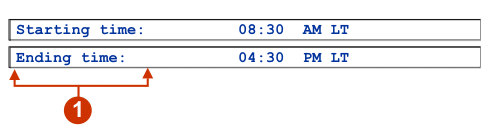
The following figure shows how a label widget appears on a transformation,
using the data from the Text component
example as input:
Figure 1. Label widget example
Label
The following settings can be configured for this widget:
Trim spaces
If selected, white space (extra spaces) is removed from both
ends of the selected text.
Style class (Web-only)
Optional. The CSS style class associated with the generated
text. The default value is HATSCAPTION.
See Using style sheets for more information.
Style (Web-only)
Optional.Use the launcher
button next to this field to open a style properties dialog. This
dialog frees you from the need to understand CSS to change the font,
color, or other style settings for the widget. See Using style sheets for more information.
Have feedback?
Google Analytics is used to store comments and ratings. To provide a comment or rating for a topic, click Accept All Cookies or Allow All in Cookie Preferences in the footer of this page.