The link (item selection) widget is responsible for rendering the
item selection component as links.
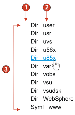
The following figure shows how a link (item selection)
widget appears on a transformation, using the data from the Item selection component example as input:
Figure 1. Link
(item selection) widget example
Show input field (no)
Number of columns per row (defaults to 1)
Layout (table)
The following setting can be configured for this widget:
Layout
Specifies how the links will be arranged on the HTML page. Options: Table, Separated.
Number of columns per row
Specifies how many instances of this widget should appear on
each row of the rendered HTML page.
Separator
Specifies what separator you want to use to separate the rendered
links on the HTML page. You can select from the drop-down list or
type in your own in the entry field.
Show input field
Specifies whether to display an input field for each link,
and the location of the input field (to the left/right of the links).
Options: No, Left of captions, Right of captions.
Selection value
Specifies characters to place to the left of the input field.
Key to automatically send
Specifies which AID key to send to the host, or none.
Link style class
Optional. The CSS style class associated with the generated
launcher link. The value of the class attribute of the HTML link tag
will be set to this value. The default value is HATSPROTLINK HBLANK. See Using style sheets for
more information.
Style
Optional.Use the launcher
button next to this field to open a style properties dialog. This
dialog frees you from the need to understand CSS to change the font,
color, or other style settings for the widget. See Using style sheets for more information.
Have feedback?
Google Analytics is used to store comments and ratings. To provide a comment or rating for a topic, click Accept All Cookies or Allow All in Cookie Preferences in the footer of this page.