
Smart phone and tablet starter stores: Grid
The grid is used to display touchable content in cells in smart phone and tablet starter stores.
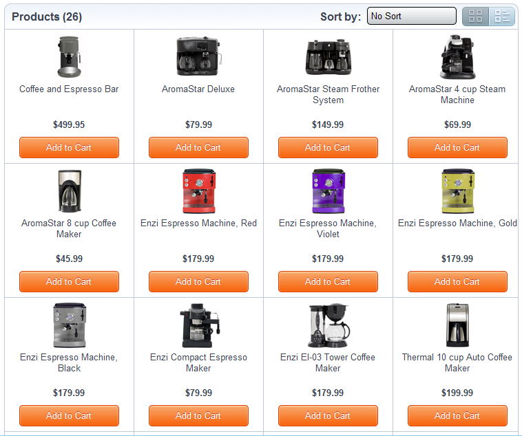
Sample screen capture
Starter store implementation
- Smart phone
- Tablet
Implementation details
- A grid where the content of the cell can be custom data such as images, or text.
- Custom actions can be defined when a cell is touched.
- 15 products are loaded by default and a Load More button is displayed if there are more than 15 products on the grid. AJAX calls are used to load more products.
- Depending on the screen orientation, 3 or 4 products per row arre
displayed on the grid. This can be customized in the thumbnail1.css
file through the following CSS code:
@media (orientation:portrait) {
.catalogEntryGrid > li {
width: 33.3%;
}
}

@media (orientation:landscape) {
.catalogEntryGrid > li {
width: 25%;
}
}