Navigation | HCL Digital Experience
These navigation portlets can be added to your page from the Create Content Navigation view when in Edit mode.
Navigation Portlet Types are mostly based on the Block template. They are used wherever a block of content needs to be displayed in its own portlet. It is used in the social media tools portlet and the details portlet that is used on many of the details pages.
A block can be removed from the output by testing for the empty data before headers and footers are rendered. This technique is used in a number of places in Content Template Catalog to render optional data.
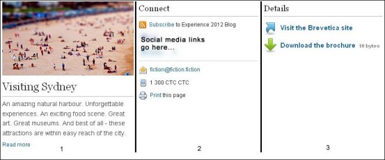
- Visiting Sydney is a single-item navigation
block.
It contains an image, descriptive text, and a "Read more" link.
- Connect is a tools and information block.
It includes tools for subscribing to an RSS feed, sending email, calling for more information, and printing the page.
- Details is a current item details block.
It includes a link to an external site and a link to a PDF file.
Block portlet configuration
- Block Title
- Some block designs include a title in their header design. The title entered here is displayed in those list designs.
- Block Style
- Much of the design of each portlet is defined in the CSS file that is linked to that portlet. You can enter the name of alternative CSS files here to change some design elements of the content that is displayed in the portlet.
- Block component
- The component that is selected here defines what content is displayed in the body of the portlet.
- Header Component
- The component that is selected here defines what is displayed in the header of the portlet.
- Footer Component
- The component that is selected here defines what is displayed in the footer of the portlet.
- Context Override
- You can select a site, site area, or content item to use as the default context of the portlet. This is used instead of the default portlet context.
Rendering headers and footers
The main component that is referenced in a Block configuration is responsible for rendering the header and footer.When you create a new Block component, you must ensure that the main component renders the header and footer. If you forget this step, the header and footer do not render.
Headers and footers are not built into the presentation template for the following reasons:
- To support the use of paging information tags in headers and footers, the header and footer must be rendered inside the component that runs the query.
- To allow conditional hiding of the entire block or list of information, the code inside the list or block can decide to render nothing at all.
To add header and footer rendering into custom components, use the fragments that are called "Design Template Header" and "Design Template Footer." You can find them in the Fragments folder in the CTC Design library.