
Predefined dynamic kit details page
In the responsive predefined dynamic kit details page, customers can view complete and detailed information about a predefined dynamic kit. To use this page, your store must be integrated with Sterling Commerce and you must enable Sterling Configurator. Customers can click a Reconfigure button on the page that opens a configuration page. The configuration page calls Sterling Configurator to enable customers to choose different components to include in the dynamic kit.
This page is managed in the Commerce Composer tool.
Screen captures
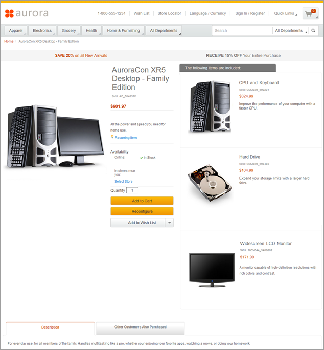
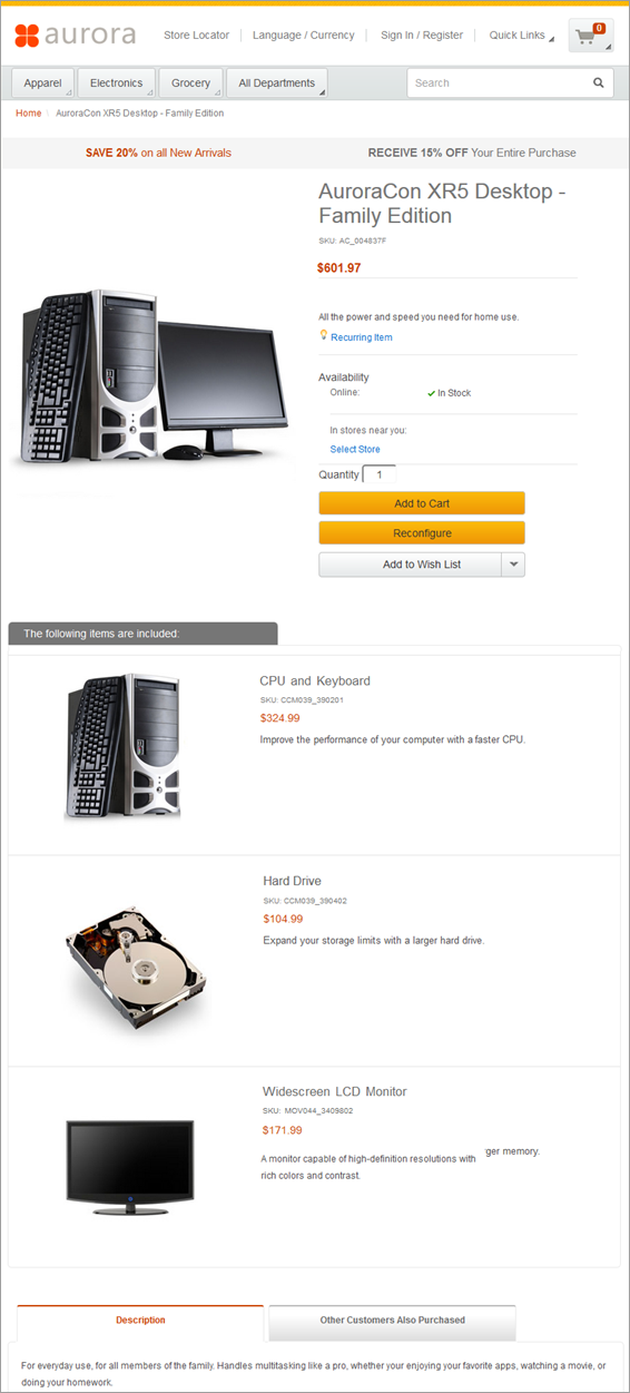
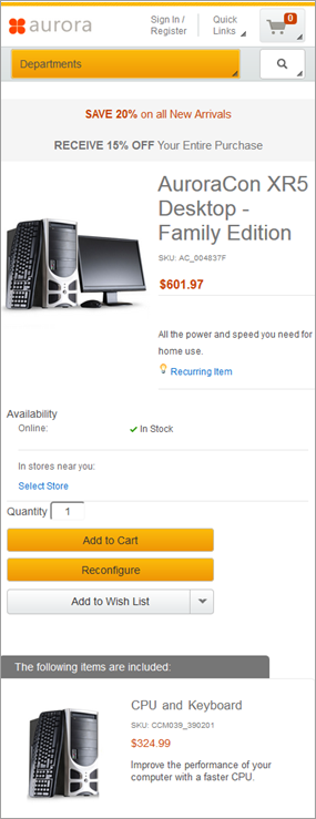
The following screen captures show how the responsive predefined dynamic kit details page adapts to desktop, tablet, and mobile devices.
Desktop screen capture
Tablet screen capture
Mobile screen capture
Layout, template, and page information
In the Aurora starter store, the predefined dynamic kit details pages use the default layout for their page type. The default layout contains Commerce Composer widgets, but Management Center users cannot open the default layout in the Commerce Composer tool to change the widgets in the layout. Default layouts are managed by IT developers. However, several of the widgets in the default layout contain e-Marketing Spots that Management Center users can manage in the Marketing tool. If the default layout is not appropriate, in the Commerce Composer tool, Management Center users can create a layout and assign it to the applicable predefined dynamic kit pages.Wireframe
The following wireframe represents the responsive Catalog entry page
layout that is used
for the default layout for predefined dynamic kit details pages:
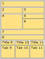
Widget information
The following Commerce Composer widgets are included in the default layout for the responsive predefined dynamic kit details page:
| Slot | Widget Type | E-Marketing Spot or Content Name |
|---|---|---|
| 1 | Breadcrumb Trail widget | (not applicable) |
| 2 | E-Marketing Spot widget (Common) | HeaderLeftAdvertisement |
| 3 | E-Marketing Spot widget (Common) | HeaderRightAdvertisement |
| 4 | Full Image widget | (not applicable) |
| 5 | Name, Part Number, and Price widget | (not applicable) |
| 5 | Discounts widget | (not applicable) |
| 5 | Short Description widget | (not applicable) |
| 6 | Inventory Availability widget | (not applicable) |
| 6 | Shopper Actions widget | (not applicable) |
| 6 | Facebook Like widget | (not applicable) |
| 8 | Components widget | (not applicable) |
| 8 | Merchandising Associations widget | (not applicable) |
| Title 9 | Text Editor widget | (not applicable) |
| Tab 9 | Long Description widget | (not applicable) |
| Tab 9 | Descriptive Attributes widget | (not applicable) |
| Tab 9 | Associated Assets widget | (not applicable) |
| Title 10 | Text Editor widget | (not applicable) |
| Tab 10 | E-Marketing Spot widget (page-specific) | [page_name]ProductRight_CatEntries |
JSP files
PDKDisplay.jsp represents the entire page.The Commerce Composer widgets that are included in this layout are defined by the following top-level JSP files:
- BreadrcrumbTrail.jsp file
- EMarketingSpot.jsp
- FullImage.jsp file
- NamePartNumberAndPrice.jsp file
- Discounts.jsp file
- ShortDescription.jsp file
- InventoryAvailability.jsp file
- ShopperActions.jsp file
- FacebookLike.jsp file
- Components.jsp file
- MerchandisingAssociations.jsp file
- LongDescription.jsp file
- DescriptiveAttributes.jsp file
- AssociatedAssets.jsp file
- ContentRecommendation.jsp file (defines the Text Editor widget)