Flexible page component layouts | HCL Digital Experience
Adding flexibility to your layouts allows page components to adjust to fit in different parts of the layout. For example, you can use relative widths so page components adjust to the parent container, you can crop images to make them smaller, and you can use relative positioning of elements within the container.
Page components can be made even more flexible by using overrides based on the layout container. Using overrides makes it possible for the same page component to be used in different parts of the page, resizing to fit and changing its layout as well.
For example, the contentSlideshow style is for a list of slides with a caption block. When this style is used in the main column, the caption appears to the side of the slideshow, and the slideshow itself is wide. If you use this style in the sidebar column, the layout changes to a stacked layout. The same page component can be dragged around the page and it adjusts to fit.
The following examples demonstrate this concept.
The first example shows the slideshow in the main column.

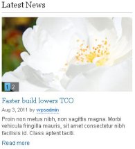
The second example shows the slideshow in the sidebar column.
The following examples compare a promotional slideshow at full width with a version that fits into a smaller container. The results are produced through a combination of cropping and relative position of elements.
This image shows the promotional slideshow in a full-width container.

The second example shows a promotional slideshow in a main container with a restricted width.