wc.widgets.ValidationTextbox
The ValidationTextbox widget is used as input box with validation function in forms. With
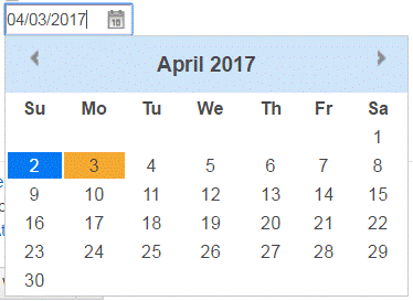
ValidationTextbox widget and JQuery datepicker widget, you can input a date by
either typing or selecting from a calendar. ValidationTextbox requires wcTooltip widget to display
invalid messages.
Sample Output
Example
<input data-widget-type="[‘datepicker’, ‘wc.ValidationTextbox’]"
   data-widget-options="[{‘altField’: ‘#shippingDate’},
       {‘regExp’: ‘^\\d\\d/\\d\\d/\\d\\d\\d\\d$’, ‘canBeEmpty’: true, ‘submitButton’: ‘#submit, ‘invalidMessage’: ‘Invalid date. Use mm/dd/yyyy format’}]" />
Options
- regExp
- (String) A JavaScript regular expression string to ensure that the typed date is in a valid format.
- canBeEmpty
- (Boolean) Determines whether the text box can be empty. The default value is true.
- trimBeforeValidation
- (Boolean) Determines whether the value in the text box is trimmed. The default value is true.
- invalidMessage
- (String) The message to display as a tooltip if the input is invalid.
- submitButton
- (String) A jQuery selector of the button that submits the form that contains this ValidationTextbox. If the contents of the ValidationTextbox is invalid, then the button is disabled.
- submitButtonDisabledClass
- (String) The CSS class to add to the Bubmit button if disabled. The
default value is
disable. - errorClass
- (String) The CSS class to add to the ValidationTextBox if the input is invalid. The default
value is
error. - customValidateFunction
- (Function) A customized validate function that can return an error message.
- onValidInput
- (Function(string)) A function that gets called each time that the user enters a valid input. The value in the text box is passed to the function.