wc.widget.ScrollablePane
The ScrollablePane widget displays a scrolling thumbnail picker that displays product images and details. It provides a scrolling effect for the items or images that are contained within the content of the widget. Each item within the scrollable pane must be in contained in a ContentPane widget. The scrollable pane supports both automatic and manual scrolling of the items that are displayed in the widget.
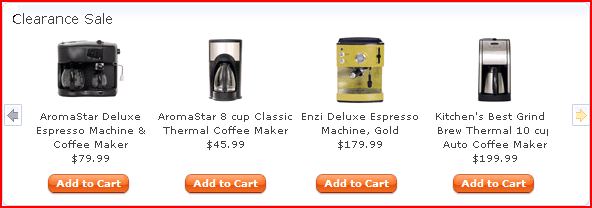
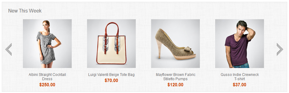
Sample Output
Example
<div id="id" dojoType="wc.widget.ScrollablePane"
  autoScroll='false'
  altPrev = '<fmt:message key="SCROLL_LEFT" bundle="${storeText}" />'
  altNext = '<fmt:message key="SCROLL_RIGHT" bundle="${storeText}" />'>
  <div dojoType="dijit.layout.ContentPane" class="imgContainer">
    HTML markup of the scrollable object
  </div>
  <div dojoType="dijit.layout.ContentPane" class="imgContainer">
    HTML markup of the scrollable object
  </div>
</div>
Styling
- imgContainer
- Each item in the scroll pane is contained within a division with the imgContainer class. Each scrollable item is contained within a division with this class.
- navNext
- The styling of the right navigation control.
- navPrev
- The styling of the left navigation control.
- thumbsNode
- The styling between the thumbScroller and the imgContainer.
- thumbOuter
- The entire ScrollablePane widget is contained within a division with this class.
- thumbScroller
- All the scrolling items.
Parameters
- altNext
- (String) The alternative (alt) text for the right button control.
- altPrev
- (String) The alternative (alt) text for the left button control.
- autoScroll
- (Boolean) This flag indicates whether the scrollable pane scrolls automatically or manually. When the value is true, the scrollable pane scrolls automatically. The default value is false.
- autoScrollDir
- (Integer) Indicates the scrolling direction. The acceptable values are -1 and 1. The default value is 1.
- buttonSize
- (Integer) Indicates the button size, in pixels.
- delay
- (Integer) Indicates the delay time, in milliseconds, of the animation.
- direction
- (Integer) Indicates the direction of the scrolling animation. The acceptable values are -1 and 1. The default value is 1, where the animation scrolls to the left, and new products appear from the right when displayed horizontally. The animation scrolls up, and new products appear from the bottom when displayed vertically.
- isHorizontal
- (Boolean) Indicates whether to display the thumbnails horizontally or vertically. When the value is true, the thumbnails are displayed horizontally. When the value is false, the thumbnails are displayed vertically. The default value is true.
- itemSize
- (Integer) Indicates the width, in pixels, of each scrollable item.
- scrollByPage
- (Boolean) Indicates whether the list must be scrolled by page instead of by item. The default value is false.
- totalDisplayNodes
- (Integer) Indicates the total number of items to show at one time.