Visualizing Data
The Visualization Tool allows you to view and manipulate data across your entire managed network.
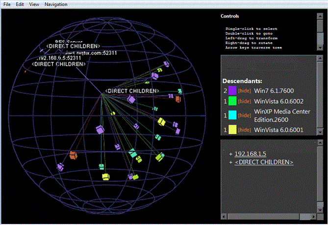
It lets you visualize various hierarchical relationships in your network, using an interactive 3D sphere to map the data.
The Visualization Tool makes it possible to view a real-time graphical network map showing Fixlet relevance, Action status, and Retrieved Properties.
As an example, you could view all computers that are currently unpatched for MS04-011 across an enterprise network, displayed as an Active Directory hierarchy. Then you could watch the clients change from red to green as they get patched in real-time across your network. As another example, you could view all Clients that are currently using Microsoft Office, colored according to version.
Or you can create your own hierarchy. You could assign settings on all your machines named 'city', 'building', and 'floor'. You could then create a dynamic setting called 'location' that concatenates these properties:
set setting location = (value of setting 'city' & ';' & value of setting 'building' & ';' & value of setting 'floor')
Specify a semi-colon as the delimiter of this setting to visualize your computers as a location-based hierarchy, from each networked city down to the floor of every building.
To create your own custom view of the data, follow these steps:
- Select Tools > Launch Visualization Tool...
- There
are three tabs in the Visualization Parameters dialog:
- General: Specify the desired display hierarchy from among Relays, Active Directory, IP Address, or Retrieved Property.
- Colorization: Indicate how you want to color-code the client nodes. You can base your color scheme on Fixlet Relevance, Baseline Relevance, Retrieved Properties, Action Status, or a custom Relevance clause.
- Computers: Limit the computers you want to display, using Active Directory and Retrieved Properties as filters. To show all the computers under Endpoint management, click Show all computers.
- Click OK to generate your customized visualization of your network.
- A graph of your network, mapped onto a 3D sphere, is displayed. You can now use the Controls listed in the upper right corner to change your view of the data.
- Double-click a computer node to bring it to the forefront. Drag the elements in the graph to tweak the viewpoint.
- You can continuously rotate the model by selecting View > Spin Mode.
- Use the Navigation menu to move through the hierarchy, from each selected computer to its sibling, parent or child.