Charts
Reports often include a chart to summarize the data. Charts and graphs help to clarify major trends hidden in a detailed list. Depending on the data, you can make pie charts, columnar graphs, or historical trend sheets with just a few mouse clicks.
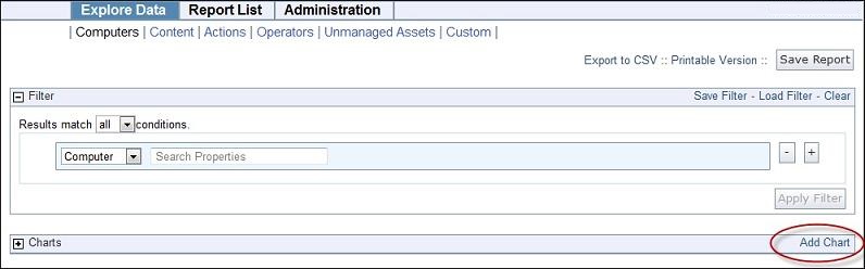
If a chart is available, the interface can be found immediately beneath the Filter interface. Click the Add Chart link.
Depending on the data set you are looking at, the Chart Wizard has a default setup that is appropriate. For a chart on computers, the wizard prompts you for a computer property.
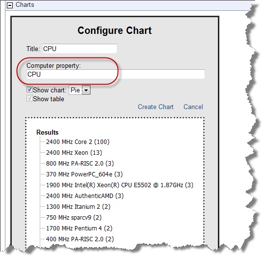
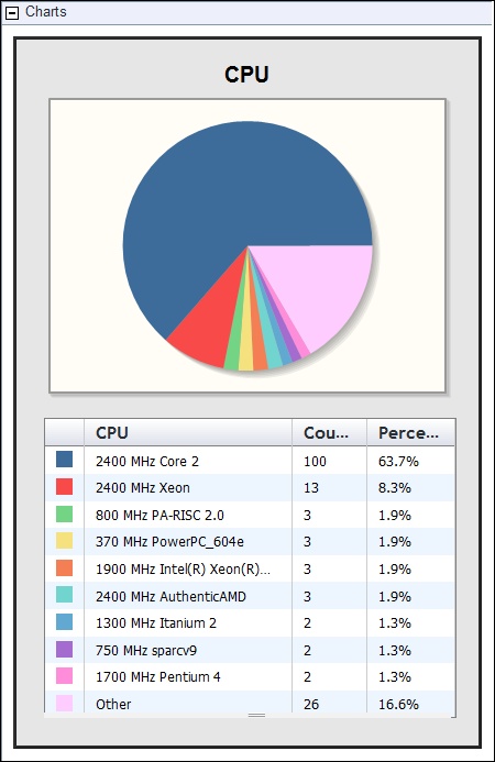
Here we have used the pull-down menu to chart CPUs on our network. The title is automatically filled in to reflect our choice of computer property. You can change it if you want. Note that a typical chart includes a table below it. Use the check boxes to specify whether you want a chart, a table, or both.
We have kept the default pie chart, but we could have chosen a bar chart instead. In the dotted box at the bottom of the wizard, you can choose to give some extra order to the data by grouping records together.
When you are ready, click the Create Chart link.
Note that we created this chart simply by selecting a single item (CPU) from a pull-down menu.
When you mouse over a chart, a tool bar appears.

The top icon lets you delete the current chart, the wrench lets you edit the chart, and the grabber icon at the bottom lets you position the chart.