Analyzing an alert instance
By using Machine Learning techniques to predict KPIs time series, AIDA can detect anomalies in a KPI trend and help you quickly identify the root cause of problems.
Before you begin
- From the Anomaly Widget on the Workload Dashboard.
- From AIDA menu on the left-hand sidebar, by clicking on Overview and selecting an alert instance.
- From AIDA menu on the left-hand sidebar, by clicking Alert Definitions, selecting an alert, an then an alert instance.
- From the link provided in the alert email notification (for AIDA administrator only).
-
- AIDA’s prediction model might not have enough data yet
- Aida uses a machine learning model based on historical data. Maybe the model still has little data available to make accurate predictions. In this case, wait for the model to get more data.
-
- The Machine Learning algorithm might need some tuning
- KPIs prediction is based on a number of tuning parameters, such as the tolerance interval width, that must be properly customized. Try to better configure the tuning parameters and run a retrain process to recalculate the prediction interval with the new parameters.
-
- You might want to pause the alert
- If you think this alert is a false alert, or you don’t want to be bothered by this alert for the next few hours or days, you can pause the alert generation.
About this task
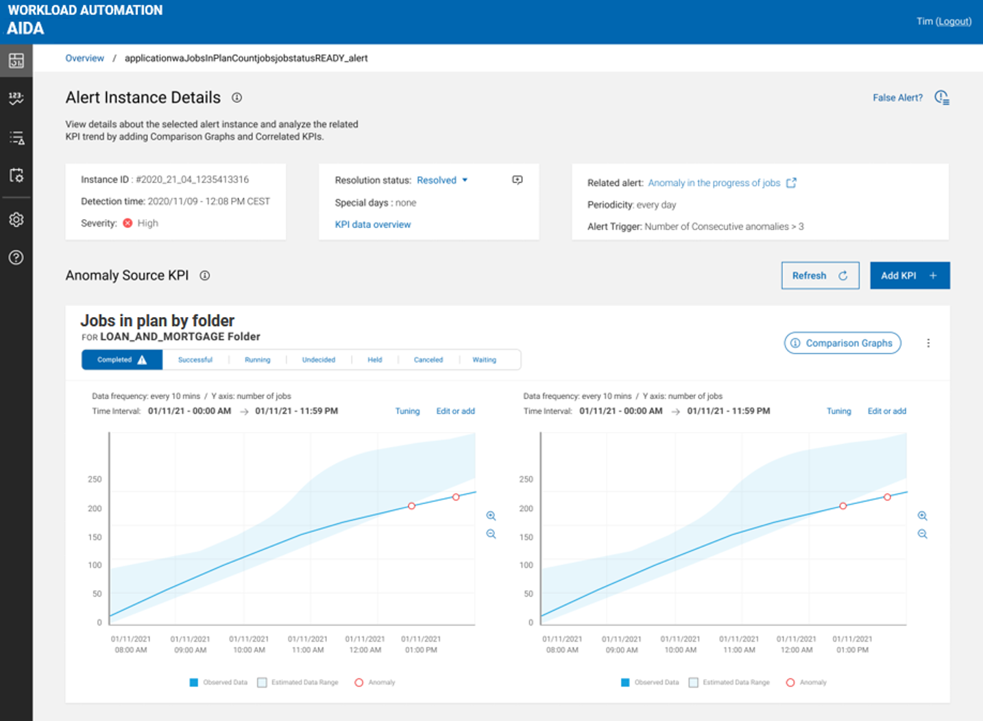
- Instance ID
- The alert instance identifier.
- Detection Time
- Date and time when the alert instance was generated.
- Severity
- The severity of the alert instance. For details, see Basic concepts.
- Resolution Status
- The alert instance status: can be: Open or Resolved. Here you can change the status of the alert instance that you are analyzing. Alert instances in Open status are automatically marked as Resolved after a time period defined by the RESOLVE_ALERTS_AFTER_DAYS parameter configured for AIDA Exporter component (default value = 1 day)..
- Special Days
- Specifies if the alert instance was detected on a special day or not.
- KPI Data Overview
- Click this link to see details about the anomaly source KPI.
- Related Alert
- The name of the related alert.
- Periodicity
- How often KPI data is checked to detect anomalies.
- Alert Trigger
- Set of conditions defining the alert.
The Anomaly Source KPI section shows graphs related to the KPI anomalous trend that you can compare with the trend over different time intervals. A comparison graph is shown, by default, to the right of the KPI graph, representing the KPI trend on the previous day. You can also add correlated KPIs to the data analysis to find the root cause of problem.
- Date and time of the observation
- Current value: the KPI observed value
- Estimated: the KPI interval estimation
- Date and time of the observation
- Current value: the KPI observed value
- Estimated: the KPI interval estimation
- Deviation: the minimum distance (with - or + sign) of the KPI observed value from its interval estimation.
- Click on Edit or add to edit the graph time interval, or add time intervals to the graph for comparison purposes. For details, see the task Setting time intervals with the Datepicker below.
- The menu icon in the upper right corner of the graph contains the following additional
actions:
- Duplicate graph, to create a comparison graph with single or multiple time intervals for comparison purposes.
- Tuning, to configure the KPI prediction parameters in the Tuning side panel. For example, you might run this action to increase or decrease the tolerance interval for anomaly detection. After tuning, a retrain is needed to immediately apply your changes. Refresh the graph to see the tuning result on the KPI prediction. Tuning is available to AIDA administrators only. For details, see Configuring AIDA for prediction.
- Refresh, to refresh the graph after you run some tuning adjustments.
- Delete, to delete the graph.
- For KPIs belonging to the Jobs category, an action icon is also present to open the workstation or job properties panel directly in HCL Workload Automation.
- Comparison graphs with the KPI trend over different time intervals
- Correlated KPI graphs
Adding comparison graphs
About this task
- KPI: Jobs in plan by status
-
For the KPI Jobs in plan by status, a comparison graph is shown, by default, representing the KPI trend during the previous day.
For both graphs, you can edit the time interval, or add time intervals for comparison:
- In the graph that you want to modify, click Edit or add to open the Datepicker
panel where you can:
- edit the time interval
- add time intervals for comparison
- In the graph that you want to modify, click Edit or add to open the Datepicker
panel where you can:
- KPIs for critical jobs: Number of uncompleted predecessors, Estimated end time, Confidence factor
-
You can edit the time interval, or add multiple time intervals to any KPI graph for comparison:
- In the graph, click Edit or add to open the Datepicker panel where you can:
- edit the time interval
- add time intervals for comparison
To enhance the analysis, you can generate an additional graph.
- From the menu icon in the upper right corner of the graph, select Duplicate graph. The Datepicker panel opens where you can create a comparison graph with single or multiple time intervals.
- In the graph, click Edit or add to open the Datepicker panel where you can:
For details about Datepicker, see Setting time intervals with the Datepicker.
Adding correlated KPIs
Procedure
- Use the search bar to refine your search.
- Select one or more KPIs.
- Click the Add KPI button.
Setting time intervals with the Datepicker
Before you begin
In the Datepicker panel, select the type of interval:
- Single Interval
-
- To edit a time interval in a KPI graph
- To add a KPI comparison graph with a single time interval
- Multiple Intervals
-
- To edit multiple time intervals in a KPI graph
- To add a KPI comparison graph with multiple time intervals
Setting a single time interval
About this task
- Start Date
- Start Time
- End Date
- End Time
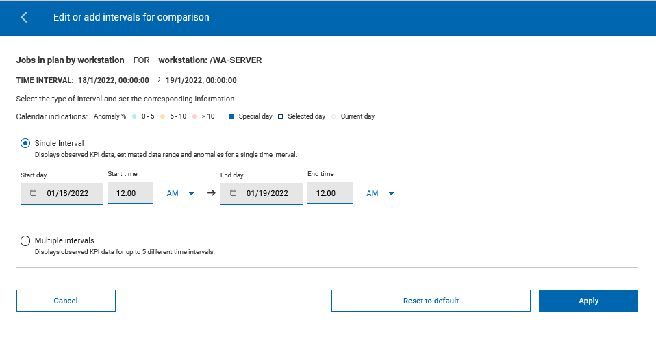
Two calendar widgets are provided to assist you in setting a new interval: the left calendar assists you in setting the start date, while the right calendar assists you in setting the end date.
To further assist you in setting a new interval, both calendars highlight:
- Anomaly %
-
The percentage of observed KPI data points that fall outside the expected range of values in the reference time interval:
- < 6 : Low
- 6-10: Medium
- >10: High
- Special days
- Days on which a KPI trend is affected by seasonality factors such as holidays, vacation, business cycles, recurring events.
To set a time interval, run the following steps:
Procedure
- Modify the Start Date and End Date current values, or select the new start date and end date directly on the calendars. To set an interval within a single day, select the same day on both calendars.
- Modify the Start Time and End Time current values.
- Click Apply.
Results
Setting multiple time intervals
About this task
- Start Time
- Interval duration (days + hours)
- End Time
You can customize up to five intervals for comparison. 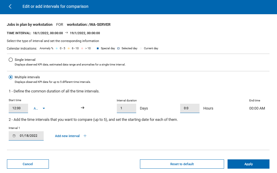
- Anomaly %
-
The percentage of observed KPI data points that fall outside the expected range of values in the reference time interval:
- < 6 : Low
- 6-10: Medium
- >10: High
- Special days
- Days on which a KPI trend is affected by seasonality factors such as holidays, vacation, business cycles, recurring events.
To set multiple time intervals (up to five), run the following steps:
Procedure
- Modify the Start Time and Interval duration values. The End Time value updates automatically.
- For each time interval that you want to set, fill in the Starting Date field or use the calendar to set it.
- Click Add new interval to set a new time interval.
- When you have set all the desired time intervals, click Apply.
- Select Reset to default to return to the original time interval, or Close to close the Datepicker panel.
Results
- Observation time
- KPI observed value for each time interval