Testing device detection and redirection to device-specific storefronts
In this lesson, the device detection and redirection are tested in the storefront on a desktop browser to simulate mobile device usage. The new links in the page footer sets the cookie to the value corresponding to the target device and displays the page from the corresponding storefront layout.
About this task
Procedure
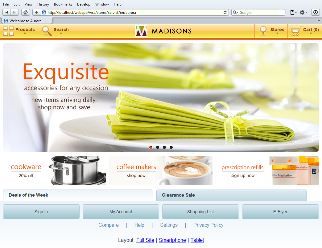
- In a Safari or Google Chrome browser, navigate to the store
home page. Enter the following URL:
http://host_name/webapp/wcs/stores/servlet/en/store_name.

- Click the Tablet link at the base
of the page. This link changes the page layout to the tablet device
layout. The cookie is set to identify itself as a tablet device and
refresh the page in the tablet storefront.
- If the page does not refresh automatically, refresh the
page. The home page for tablet devices displays.Note: The URL does not change. This is the expected result.
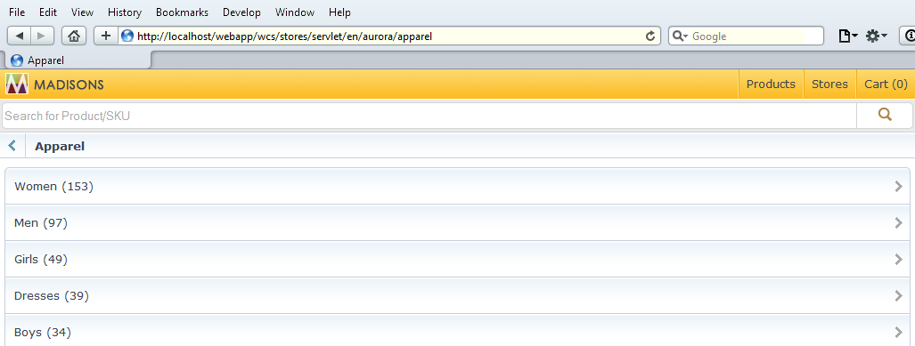
- Click the Smartphone link at the
base of the page. This link changes the page layout to the smartphone
device layout and displays the top categories page.
Since the smartphone starter store has an additional index page, it results in different topology than the desktop and tablet starter stores. The struts forward mapping is set up to redirect users to the smartphone top categories page.
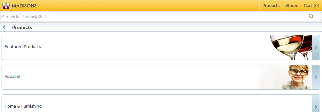
- While on the smartphone home page, click the Apparel category.
The category page displays.
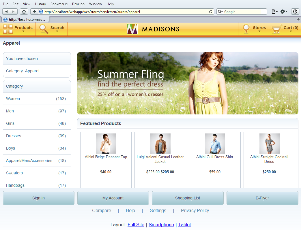
- Click the Tablet link at the base
of the page. This link changes the page layout to the tablet device
layout. The Apparel category page displays for a tablet device.
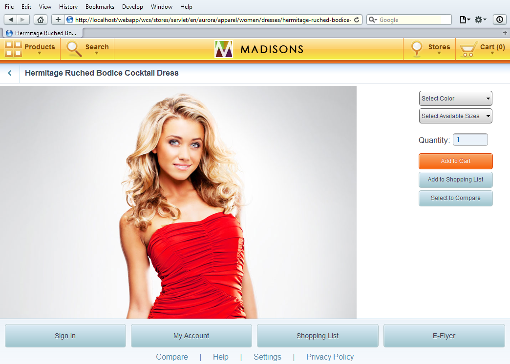
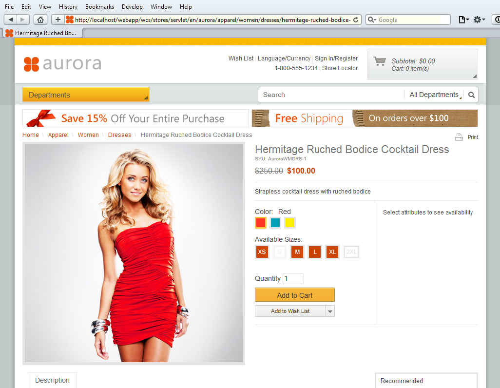
- Select Hermitage Ruched Bodice Cocktail Dress.
The product page displays.
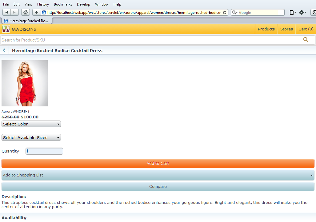
- Click the Smartphone link at the
base of the page to change the layout to the smartphone device. The Hermitage
Ruched Bodice Cocktail Dress product page displays using
the smartphone-specific storefront styling.Note: The URL does not change.
- Click the Tablet link at the base
of the page. The product page displays using the tablet-specific storefront
styling.