Mobile Web starter stores overall layout
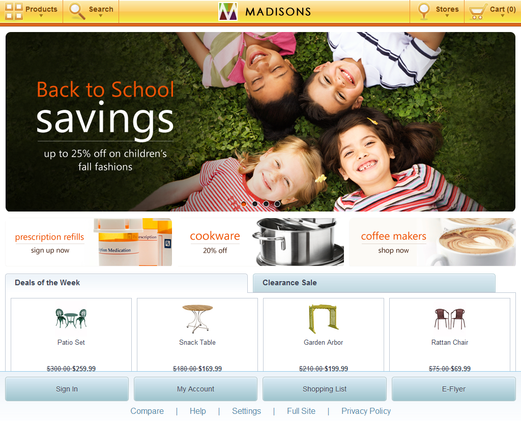
The overall layout of Mobile Web starter stores contains three main sections: the header and footer, with the site content wrapped between. The header contains the store logo, search options by keyword or product categories, store locator, and the shopping cart product total. The footer contains links to commonly browsed additional sections, such as signing in to the storefront, and store settings.
Screen captures
The overall layout is available on both smart phone and tablet devices.
Smart phone screen capture


Tablet screen capture
Elements of the overall layout
The overall layout contains the following page elements:
JSP files
- CachedHeaderDisplay.jsp displays the store header on smart phone and tablet devices.
- CachedFooterDisplay.jsp displays the store footer on smart phone and tablet devices.
e-Marketing Spots
- e-Marketing Spots that contain a Mobile prefix are displayed on smart phone devices. For example, MobileHomePageFeaturedProducts.
- e-Marketing Spots that contain a Tablet prefix are displayed on tablet devices. For example, TabletHomePageFeaturedProducts.